Editor's Note: Take a look at our featured best practice, KPI Compilation: 600+ Supply Chain Management KPIs (141-slide PowerPoint presentation). This presentation is a comprehensive collection of Key Performance Indicators (KPI) related to Supply Chain Management (SCM). A KPI is a quantifiable measure used to evaluate the success of an organization, employee, or process in meeting objectives for performance.
KPIs are typically [read more]
Most Supply Chain disruptions are not surprises. They are risks that were visible somewhere in the organization, just not in a form that connected to where the decision needed to be made. A purchasing team knows which items are single-sourced. A planning team knows which suppliers are trending toward late deliveries. A quality team knows which supplier’s defect rate has been drifting for 3 months. None of these 3 facts, on their own, is alarming. Together, they describe a supplier that is about to cause a stockout, and by the time all 3 facts reach the same room, the stockout has often already started.
A Supply Chain Risk Radar closes that gap with 4 connected control points, moving from strategic classification down to shop-floor quality. Each one narrows the question being asked, from “what matters?” to “what is happening right now on the receiving dock?”
Control Point 1: Strategic Classification
Before any risk can be prioritized, it has to be classified. The Kraljic Portfolio Matrix scores every purchased item on 2 dimensions, Profit Impact and Supply Risk, and sorts it into 1 of 4 categories: Strategic, Leverage, Bottleneck, or Non-Critical. Applied to an 18-item purchasing portfolio, this typically surfaces a small, uncomfortable cluster: in one such portfolio, 3 items landed in the Bottleneck quadrant, meaning low spend but high supply risk, the category most likely to be ignored precisely because it does not show up on a spend report. In that same portfolio, Strategic items, high spend and high risk, accounted for roughly 30% of total spend concentrated in just 3 items, with a single-source sensor module carrying the highest risk score of the entire portfolio despite modest spend.
This is the layer that answers a deceptively simple question: which of our hundreds of purchased items actually deserve a risk conversation? Spend alone will never surface a Bottleneck item, and that is exactly why it needs its own quadrant.
Control Point 2: Portfolio Risk and Resilience
Once the critical items and suppliers are identified, the next question is how exposed the organization actually is. A Supply Chain Risk Assessment & Management Dashboard scores every supplier from Low to Critical risk, tracks single-source dependency as a percentage of the portfolio, and runs a disruption simulator comparing normal versus worst-case safety stock requirements, item by item. In a representative 8-supplier, 15-item portfolio, a resilience score of roughly 61% coexisted with 4 high-risk and 1 critical-risk supplier, an average of only 14.3 days of inventory coverage, and a worst-case safety stock cost of over 31,000 in additional working capital if every high-risk lane were disrupted simultaneously.
The value of this layer is that it turns “we have some risky suppliers” into a number: how many days of coverage remain, and what it would cost to buy that risk down with safety stock, before the disruption happens rather than after.
Control Point 3: Demand Amplification
Even a portfolio with well-managed suppliers can still get blindsided by a purely internal cause: order volatility that grows as it moves upstream, known since Forrester’s original 1961 work and later quantified by Lee, Padmanabhan, and Whang as the bullwhip effect. A Bullwhip Effect & Supply Chain Amplification Simulator applies the Chen et al. order-up-to formula across 4 tiers, retailer, wholesaler, distributor, and manufacturer, and calculates the order-variance-to-demand-variance ratio at each one. In one 30-period simulation with a 1-period lead time and a 6-period forecast window, a customer-demand coefficient of variation of just 8.5% amplified to a manufacturer-tier order ratio above 5, meaning the factory was seeing order swings more than 5 times larger than actual end-customer demand, with the ratio compounding at every tier in between.
This layer exists because a supplier can be perfectly reliable and still get blamed for a stockout or a mountain of excess inventory that was actually caused by a forecast window too short relative to lead time, several tiers downstream. Quantifying the ratio at each tier shows exactly where the distortion is being introduced, and whether the fix belongs in forecasting, ordering policy, or shared point-of-sale data rather than in the supplier relationship at all.
Control Point 4: Supplier Quality Monitoring
The final control point is the one closest to the receiving dock: is what actually arrives meeting spec, supplier by supplier, month by month? A Supplier Quality Dashboard tracks defect rate, parts-per-million (PPM) defective, first-pass yield, reject rate, complaint rate, on-time delivery, and audit score, then blends them into a single weighted quality score per supplier. Applied to an 8-supplier base receiving roughly 446,000 units, this typically produces a wide spread even among “approved” suppliers: quality scores ranging from the low 90s down into the 60s, PPM rates from under 5,600 to nearly 27,000, and first-pass yield from over 99% down below 97% for the weakest supplier, with high-risk quality flags concentrated in a handful of specific supplier-category combinations rather than spread evenly across the base.
This is the layer that catches the slow drift, a defect rate creeping up 2 points over 3 months, before it becomes the line-down event that finally gets everyone’s attention.
Case Study
A contract electronics manufacturer had all 4 of these capabilities, but run by 3 different teams on 3 different schedules. Its Kraljic classification, done once a year during budget season, had flagged a single-source sensor module as Bottleneck: low spend, high risk. Its supplier quality tracking, run monthly by the quality team, had shown that same module’s supplier drifting from a 91 to an 84 quality score over 2 quarters. Neither team knew about the other’s data point. When the supplier had a production issue, the resulting parts shortage triggered a bullwhip-style order spike at the distributor tier that the planning team initially read as a demand surge and responded to by over-ordering from an alternate supplier, compounding the disruption instead of absorbing it. After connecting all 4 layers into a shared monthly review, the same company caught an almost identical quality drift at a different Bottleneck-classified supplier 6 weeks earlier the following year, well before it affected a single shipment.
FAQs
Do we need all 4 tools, or can we start with just one?
Start with whichever layer already has the most reliable underlying data, usually supplier quality or the Kraljic classification, since both draw on data most organizations already collect. The other 2 layers can be added once the first is running on a regular cadence.
How often should the Kraljic classification be updated?
Annually at minimum, ideally every 6 months for organizations with fast-changing supplier bases or volatile commodity risk. It changes far more slowly than supplier quality or order data, so it does not need to be a live dashboard.
Is the bullwhip effect really worth tracking if our suppliers are reliable?
Yes, because it is often invisible from the supplier side entirely. A reliable supplier can still be blamed for volatility that was actually introduced by forecasting or ordering policy several tiers away, and the ratio is the only way to tell the difference.
What counts as a good supplier quality score?
It depends on the weighting and industry, but the more useful signal is usually the spread and the trend, not the absolute number. A supplier trending down 5 to 10 points over 2 to 3 quarters deserves attention even if the current score still looks acceptable.
How do these 4 control points typically get connected in practice?
Usually through a shared monthly or quarterly review where purchasing, planning, and quality each bring their layer’s output, rather than through a single merged system. The point is a shared cadence, not necessarily shared software.
Concluding Thoughts
None of these 4 control points is new. Most organizations already have some version of classification, risk scoring, demand planning, and quality tracking running somewhere. What usually breaks is the connection between them: the Bottleneck item nobody flagged for the quality team, the demand spike nobody traced back to a forecast window, the quality drift nobody linked to a single-source dependency. A Supply Chain Risk Radar is less about adding new measurement and more about making sure the 4 layers that already exist are looking at the same suppliers, on the same cadence, in the same room.
Interested in building out your own Supply Chain risk radar? Editable Excel dashboards for each of the 4 control points, from strategic classification through portfolio risk, demand amplification, and ongoing supplier quality monitoring, are linked throughout this article and available on the Flevy documents marketplace.
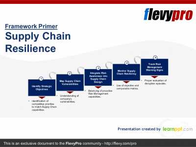
Supply Chain "resilience" is the Supply Chain's ability to respond and recover quickly to potential disruptions. It can return to its original situation or grow by moving to a new, more desirable state in order to increase customer service, market share, and financial performance.
Resilience is [read more]
Do You Want to Implement Business Best Practices?
You can download in-depth presentations on Supply Chain Resilience and 100s of management topics from the FlevyPro Library. FlevyPro is trusted and utilized by 1000s of management consultants and corporate executives.
For even more best practices available on Flevy, have a look at our top 100 lists:
These best practices are of the same as those leveraged by top-tier management consulting firms, like McKinsey, BCG, Bain, and Accenture. Improve the growth and efficiency of your organization by utilizing these best practice frameworks, templates, and tools. Most were developed by seasoned executives and consultants with over 20+ years of experience.
Readers of This Article Are Interested in These Resources
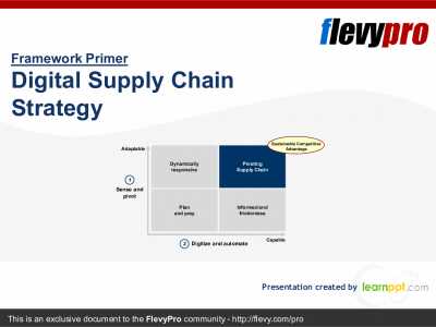
In today's Digital Age, organizations are faced with the changing nature of the demand curve and the element of uncertainty in the Supply Chain. For Operations Teams, the challenge and Competitive Advantage has become: How well we respond and execute against ongoing uncertainty.
With the world [read more]
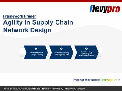
Online retailing has changed. Before, e-commerce companies fulfilled consumer demand from a small number of large-scale warehouses that carried similar catalog of items. Inventory for low-volume products were maintained in a few locations as possible while maintaining service levels that met [read more]
This presentation has 32 slides in all and covers the following topics:
Why PFEP - Benefits
Develop an Implementation Plan
Create a future state VSM
Plan For Every Part - Implementation
Step 1: Create PFEP Database - Current State (Part, Container, Shipping, Supplier, Consumption, Part [read more]
Objective of the Presentation:
To understand and explore opportunities in supply chain optimization solutions in manufacturing by analysing overall demand trends, identifying potential end-user use cases, company profiling, and benchmarking major players in the market
Sections included: [read more]
 Most Supply Chain disruptions are not surprises. They are risks that were visible somewhere in the organization, just not in a form that connected to where the decision needed to be made. A purchasing team knows which items are single-sourced. A planning team knows which suppliers are trending toward late deliveries. A quality team knows which supplier’s defect rate has been drifting for 3 months. None of these 3 facts, on their own, is alarming. Together, they describe a supplier that is about to cause a stockout, and by the time all 3 facts reach the same room, the stockout has often already started.