Editor's Note: Take a look at our featured best practice, Digital Transformation Strategy (145-slide PowerPoint presentation). Digital Transformation is being embraced by organizations across most industries, as the role of technology shifts from being a business enabler to a business driver. This has only been accelerated by the COVID-19 global pandemic. Thus, to remain competitive and outcompete in today's fast paced, [read more]
Also, if you are interested in becoming an expert on Customer-Centric Design (CCD), take a look at Flevy's Customer-Centric Design (CCD) Frameworks offering here. This is a curated collection of best practice frameworks based on the thought leadership of leading consulting firms, academics, and recognized subject matter experts. By learning and applying these concepts, you can you stay ahead of the curve. Full details here.
* * * *
 Websites became a powerful weapon in several industries. It is not only a place to share your content and present the services you are offering, but also a virtual business card of your company. Digital trends are changing rapidly, which can make your site look outdated compared to the competition if you don’t follow the newest UX tendencies. As redesigning your website can be time-consuming and demand greater investments, you might want to try and implement some new adjustments to refresh the layout.
Nowadays, users want something more than just a text. They expect some entertainment, an eye-pleasing layout, and a comfortable overall experience. To help you overcome those challenging requirements, we made a list of the top 5 ways to improve your website and make it more user-friendly.
Make it Accessible for Everyone
‘In simple terms, web accessibility means that websites and mobile apps should be developed and designed so that everybody can perceive, understand, navigate, contribute, and interact with the World Wide Web. Web accessibility can affect people with many disabilities, including but not limited to cognitive, hearing, speech, visual and physical impairments’ says Kris Rivenburgh – Chief Accessibility Officer of Essential Accessibility. If we want to create a disability-friendly website for all users, we should focus on improving the visual as well as sound aspects of our website.
Let’s say you want to give a webinar about the compelling topics on your website. How can you make it more accessible and appealing to users with visual and hearing impairments? While planning a presentation, remember to use bigger font sizes and to avoid high contrast sensitivity. You will also need to talk about the subject – invest in good quality headphones with microphones to assure your users have the best experience. You can check a website such as https://headphonesaddict.com/ and read more about some suitable options.
Improve Your Site’s Speed
Users expect your website to load within two seconds and will abandon it if nothing happens in less than four seconds. Speed does matter if you want to keep visitors and potential customers on your site. The load time of your website might affect the potential customer’s impression of how efficiently your brand works – if the page needs lots of time to start working, it might seem like an unreliable source of information not worth the user’s interest.
There are many tools to examine if the speed of your site is acceptable. The most popular ones are Pingdom and Google’s Page Speed Insights. The two main and most crucial steps are to check your server’s speed and optimize images included in your content.
Pick Your Colours Carefully
While choosing the colors, you need to remember about contrast sensitivity. People with vision impairments such as glaucoma, diabetic retinopathy, and cataract can’t recognize the colors very well.
To ensure your users’ comfort while using the page, make sure to avoid thin fonts and create a high contrast between the background and the foreground. You can check if your website is legible by slightly closing your eyes and setting a distance between your face and the screen of at least 20-30 cm. Now ask yourself those three questions.
- Are you able to freely use the website?
- Can you read the labels, navigation, and buttons?
- Do you think that a person with even more serious visual difficulties will be able to see it?
In that way, you can quickly determine problems and find elements that might need some improvement on your website.
Add Enlarging Font Sizes Features
People with low vision might struggle with reading small texts. That is why you might want to include a new feature to your website and enable users to adjust the font sizes. It can significantly boost the number of visits to your site and make it more comfortable to use.
The key to make this option work is to offer a style sheet which allows users to change the font sizes and maybe even styles without breaking the page layout. To make your website more engaging consider emphasizing CTA signs visually by making them slightly bolder.
Improve Intuitive Navigation
Intuitive navigation means that the user knows exactly what to do after entering the website. In other words, there is no hesitation while making choices on a page. There are a few ways to improve your site navigation and make it more intuitive:
- Use contrast colors and make the buttons more visible.
- Be consistent – navigation should be kept in the same order on every page and subpages.
- Use call-to-action phrases to keep the users engaged and draw their attention to key points of your page.
Conclusion
Constant website improvements and design updates are crucial to follow new UX trends and stay ahead of the competition. Nowadays, it is sure that users demand fast reactions and comfortable features. If your page is lagging and chaotic, you are likely to fail, especially in the content creating industry. That is why it is crucial to run site evaluations from time to time and reconsider the layout, as well as color choices.
Let’s remember that the internet is for everyone. Sites should be disability-friendly to make acquiring the information and using online services is comfortable and easy for all users.

225-slide PowerPoint presentation
[NOTE: Our Design Thinking presentation has been trusted by an array of prestigious organizations, including industry leaders such as Apple, MIT, NASA, Ford, Boeing, Fujitsu, Syngenta, Palo Alto Networks, and Mercer, to name just a few.]
Design Thinking is a process for creative problem solving.
[read more]
Want to Achieve Excellence in Customer-Centric Design (CCD)?
Gain the knowledge and develop the expertise to become an expert in Customer-Centric Design (CCD). Our frameworks are based on the thought leadership of leading consulting firms, academics, and recognized subject matter experts. Click here for full details.
In the modern Digital Age, advances in technology and communication, combined with the explosive growth in data information, have given rise to a more empowered global customer. Recent economic and political events highlight the need for organizations to understand how consumers view the world and the most important attributes for their purchasing decisions.
Thus, increasingly more organizations are seeking to invest and focus on Customer-centric Design. A clear understanding of customer needs and behaviors across the organization will help drive profitable growth strategies and provide the confidence to invest in opportunities at a time when staying within budget can be extremely difficult.
Learn about our Customer-Centric Design (CCD) Best Practice Frameworks here.
Readers of This Article Are Interested in These Resources

56-slide PowerPoint presentation
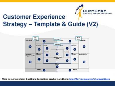
Customer Experience is fast becoming the key business battleground in many markets.
In order to be successful it is critical that all business create a Customer Experience Strategy, an all encompassing view of how they will deliver superb experiences to their customers. Having such a strategy
[read more]

35-slide PowerPoint presentation
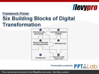
Digital Transformation touches practically every function in the entire organization. This thus requires an unprecedented amount of coordination among people, process, and technologies throughout the organization, leading to a difficult Transformation program.
The Six Building Blocks of
[read more]

143-slide PowerPoint presentation
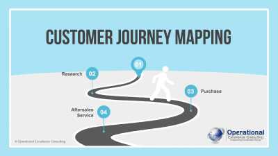
Customer Journey Mapping is the process of creating a graphical representation of the steps and stages a customer goes through to experience a product, service, an online experience, or any combination. It may focus on a particular part of the process or the end-to-end experience.
The journey
[read more]

30-slide PowerPoint presentation
Delivering great customer experiences is one of the true differentiators of many of the great organisations of our time.
However, delivering these great experiences doesnt happen overnight. Organisations need to become mature at all aspects of creating, delivering and improving customer
[read more]
 Websites became a powerful weapon in several industries. It is not only a place to share your content and present the services you are offering, but also a virtual business card of your company. Digital trends are changing rapidly, which can make your site look outdated compared to the competition if you don’t follow the newest UX tendencies. As redesigning your website can be time-consuming and demand greater investments, you might want to try and implement some new adjustments to refresh the layout.