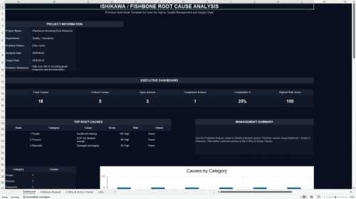
Editor's Note: Take a look at our featured best practice, Cause & Effect Analysis (Fishbone Diagram) (29-slide PowerPoint presentation). The fishbone diagram identifies many possible causes for an effect or problem. It can be used to structure a brainstorming session. It immediately sorts ideas into useful categories This presentation can be used for training shop floor team members.
Objective :-
- To understand the [read more]
* * * *
Recurring problems are costly in ways that are easy to overlook. The same late shipment, rework issue, or customer complaint can consume hours that were never budgeted. A fishbone diagram offers a structured way to identify possible causes before anyone commits to a fix. It is a thinking tool, not a verdict. Used well, it organizes what a team suspects so those ideas can be tested against evidence.
What a Fishbone Diagram Is
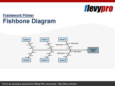
A fishbone diagram, also called an Ishikawa or cause-and-effect diagram, places the problem at the head of a horizontal spine. Possible causes branch from the spine like bones. The American Society for Quality (ASQ) includes it among the Seven Basic Quality Tools and describes its purpose plainly: helping a team identify and organize many possible causes.
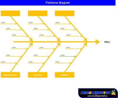
ASQ lists six traditional categories, often called the 6Ms: Materials, Machinery, Methods, Measurement, Manpower, and Mother Nature. Some teams add Money as a seventh category. These labels came from manufacturing, so adapt them for service or knowledge-based work. Categories such as People, Process, Policy, Systems, and Information may better reflect how the work gets done.
When to Use It Instead of Other Methods
Fishbone diagrams are best for breadth. They widen the search so a team does not fixate on the first plausible explanation. Other root cause analysis tools serve different purposes. The 5 Whys explores one branch in depth by repeatedly asking why a condition exists. A Pareto chart helps rank causes when frequency or cost data are available. Fault tree analysis works from the top down through logical relationships and is better suited to complex or safety-critical failures.
No single tool provides a complete analysis. OSHA guidance describes several techniques and recommends combining methods rather than relying on one. AHRQ improvement resources pair fishbone diagrams with the 5 Whys for a similar reason, while ASQ groups fishbone diagrams with tools such as Pareto charts and scatter diagrams.
How to Run a 45-Minute Fishbone Workshop
A short, timeboxed session often produces better material than an open-ended meeting. The following sequence works well for a group of six to ten people.
Write the problem statement (5 minutes). Make it specific and measurable. “Orders shipped after the promised date on the Midwest route” is more useful than “delivery problems.”
A useful test when writing a problem statement is whether it stays neutral on cause, since a statement that already implies a diagnosis narrows the diagram before the team starts.
Choose categories (3 minutes). Use the 6Ms or select labels that match the work. Four to six main branches are usually enough.
Brainstorm causes (15 minutes). Take each branch in turn. Ask for factual, observable conditions. Avoid names and blame by describing what happened rather than who was involved.
Add sub-causes (10 minutes). For each promising cause, ask why it happens. Two or three levels are generally enough during a live session.
Cluster and merge ideas (5 minutes). Similar causes often appear on different branches. Combining them can reveal where the team’s concerns overlap.
Select validation candidates (5 minutes). Flag a small number of causes for testing. Note the evidence required and assign an owner to each one.
Confirm next steps (2 minutes). Decide who will collect each piece of evidence and when the group will review the findings.
Expect to redraw the diagram. The first version records assumptions, while later versions should reflect what the evidence supports. Keeping both versions can help the team see how its understanding changed.
Validate Causes before Acting
A branch on a whiteboard is a hypothesis, not a finding. Validation may involve reviewing system logs or transaction timestamps, using a check sheet to count how often a suspected condition occurs, building a Pareto chart from those counts, or reconstructing the timeline of a specific failure.
OSHA defines a root cause as a fundamental, underlying, system-related reason for an incident. That is a useful standard for other types of problems as well. If a candidate cause is only a symptom or an isolated human error, continue investigating until you reach the process, policy, training, or design condition that allowed it.
Building the Diagram Digitally
Paper or a whiteboard may be enough for an in-person workshop. Distributed teams usually need a shared digital workspace. Common options include:
Among several options, Lucidchart’s Fishbone diagram maker provides a ready-made structure for teams that do not want to begin with an empty canvas. Check the relevant plan details for feature availability.
Lucidchart. It also supports real-time comments and collaboration, making it practical for remote sessions.
Miro. This collaborative whiteboard includes templates and flexible space for brainstorming. Check plan details if your team needs advanced diagramming or administrative controls.
Microsoft Visio. Its Cause and Effect template includes a spine and category boxes, which can reduce setup time for organizations that already use Visio.
Other options. SmartDraw and Creately provide diagram templates, while diagrams.net offers a free option for basic layouts. Canva can work when the finished diagram will be placed in a presentation.
Before choosing a tool, compare collaboration features, editing limits, export formats, and access controls. Plan details can change, so review the current vendor information rather than relying on old pricing or feature lists. If several departments will use the diagrams, test whether files can be exported in a format they can open.
A Short Worked Example
Consider a rising share of orders shipping after the promised date. Under Methods, the team notes that pick lists are batched twice daily and that cutoff times differ by carrier. Under Machinery, an aging label printer jams during peak hours. Under People, second-shift coverage drops on Fridays. Under Measurement, the promised date is calculated from order entry rather than stock allocation.
None of these observations is a conclusion. The team still needs evidence, such as a time study of the pick-and-pack sequence, printer downtime logs, shift rosters compared with late-order timestamps, and a review of how the order system calculates promised dates.
Common Pitfalls
Several failure patterns appear repeatedly. Teams stop asking why after one shallow round, jump to solutions while causes are still being listed, or mistake symptoms for underlying system conditions. They may also treat the first diagram as final instead of revising it as evidence becomes available.
A simple safeguard is to assign every leading suspected cause to an owner. Each owner should return with a specific piece of evidence, not another opinion. This keeps the diagram connected to investigation and reduces the chance of acting on the most popular assumption.
FAQ
Is a fishbone diagram enough to identify a root cause?
No. It organizes possible causes so the team knows what to investigate. Most teams combine it with the 5 Whys for depth and a Pareto chart, check sheet, or other data review for confirmation.
Which categories should I use?
The 6Ms are a common starting point, but they are not mandatory. For service or administrative work, choose categories that reflect the actual workflow, such as People, Process, Policy, Systems, and Information.
Should I use a fishbone diagram or the 5 Whys?
Use a fishbone diagram when the cause is unclear and you need to explore several possibilities. Use the 5 Whys when you already have a strong candidate and need to trace it to an underlying system condition.
What if I do not have Visio?
Lucidchart, Miro, diagrams.net, and other diagramming tools can all support fishbone layouts. Compare them based on collaboration needs, access controls, export options, and current plan limits.
Can a fishbone exercise be completed asynchronously?
Yes, although it requires clear facilitation. Post the problem statement and categories, give contributors a fixed period to add causes, and then hold a short live session to combine ideas, challenge assumptions, and assign validation work.
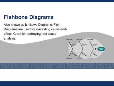
Also known as Ishikawa Diagrams, Fish Diagrams are used for illustrating cause-and-effect. Great for portraying root cause analysis.
This Fishbone Diagram PowerPoint Template is designed for professionals seeking to streamline their root cause analysis processes. The template leverages the Six [read more]
Do You Want to Implement Business Best Practices?
You can download in-depth presentations on Fishbone Diagram and 100s of management topics from the FlevyPro Library. FlevyPro is trusted and utilized by 1000s of management consultants and corporate executives.
For even more best practices available on Flevy, have a look at our top 100 lists:
These best practices are of the same as those leveraged by top-tier management consulting firms, like McKinsey, BCG, Bain, and Accenture. Improve the growth and efficiency of your organization by utilizing these best practice frameworks, templates, and tools. Most were developed by seasoned executives and consultants with over 20+ years of experience.
Readers of This Article Are Interested in These Resources
To structure our Root Cause Identification, we can use the Fishbone Technique. This document discusses the 7-step process to developing a Fishbone Diagram.
A Cause and Effect Diagram is structured brainstorming tool designed to assist an improvement team in listing potential causes of a specific effect. It is also known as an Ishikawa Diagram, for its creator, or a Fishbone Diagram, for its resemblance to the bones of a fish. Causes are often grouped [read more]
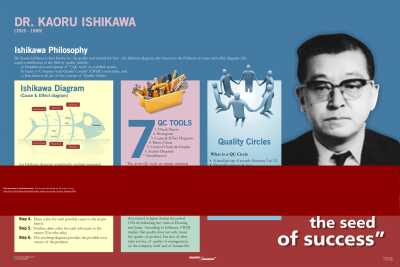
Dr. Kaoru Ishikawa is best known for the quality tool named for him – the Ishikawa diagram, also known as the fishbone or cause-and-effect diagram. His major contribution to the field of quality include,
a) Simplification and spread of ‘7-QC tools' as a unified system,
b) Input to [read more]
Conducting rigorous operational diagnostics and establishing bulletproof preventative countermeasures requires a highly structured, visually coherent causal tracking framework. Across modern engineering and business landscapes--such as Lean Six Sigma workflows, ISO-certified manufacturing hubs, and [read more]
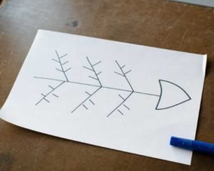 Recurring problems are costly in ways that are easy to overlook. The same late shipment, rework issue, or customer complaint can consume hours that were never budgeted. A fishbone diagram offers a structured way to identify possible causes before anyone commits to a fix. It is a thinking tool, not a verdict. Used well, it organizes what a team suspects so those ideas can be tested against evidence.
 Paper or a whiteboard may be enough for an in-person workshop. Distributed teams usually need a shared digital workspace. Common options include: