Are you selling a PowerPoint presentation on Flevy? Great! That is our best selling format and can generate a lot of recurring sales–but only if you design it right.
This guide is focused on the “science” of presentation design that is optimized for Flevy sales. You can have the most compelling content on Flevy, but that won’t lead to the most sales if your slide isn’t designed the right way. In fact, we have reformatted the content for some of our authors and noticed an immediate increase in sales after the reformatting. This is with no change to the slide content–only to the slide design.
The Golden Rule: Adopt the Consulting Presentation Framework
Consulting Presentation Framework Overview
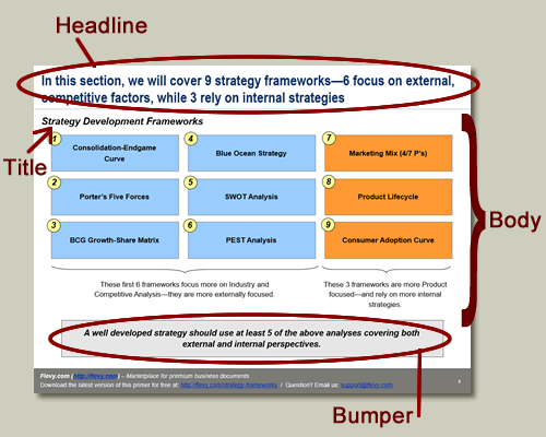
The Consulting Presentation Framework is a slide structure that every top-tier management consulting firm follows. This is the structure:
- Headline. The Headline is a sentence that appears at the top of the slide, introducing the slide.
- Body. This is the main section of the slide. On the top left of the Body, there is the Title of the slide.
- Bumper. This is in a rectangle box along the bottom of the slide. It adds further insight into the slide and answers the “so what?” question. The bumper is optional, though recommended.

Real Examples
Now, let’s see some examples. Here are Flevy authors who abide by the Consulting Presentation Framework:
- Team Neosi. Note that his author is a team of ex-McKinsey communication specialists. They specialize in selling training guides on corporate communication, the McKinsey way.
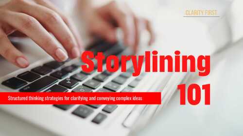
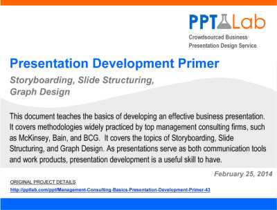
- LearnPPT and PPT Lab. This is the same firm and use the same format across all their documents.
- STRATICX. This is a strategy and innovation consulting firm from the UK.
Specific Guidelines
Here are specific guidelines for the Consulting Presentation Framework:
- Headline
- Suggested font styling: Arial Narrow, 24 pt, boldfaced. You do not need to use our suggested font style. However, what is critical is that whatever styling you choose, it must remain consistent across all your slides.
- Two lines max—if you exceed 2 lines, then reword or cut down on content.
- One sentence only.
- No ending punctuation (e.g. period).
- Tip: The Headlines of each slide should connect and tell a cohesive story.
- Body > Title
- Suggested font styling: Arial, 16 pt, boldfaced, italic.
- Just the typical title (e.g. “Executive Summary,” “Approach,” “Objectives,” etc.).
- Describes the body of the slide.
- Body
- Suggested font styling: Arial
- Don’t go smaller than font size 10. Otherwise, it becomes too difficult to read.
- Place the source on the bottom left of the slide in font size 10. E.g. “Source: Article Name, Harvard Business Review, 2015”
- Bumper
- Suggested font styling: Arial, 14 pt, boldfaced, italic.
- Two lines max—if you exceed 2 lines, then reword or cut down on content.
- One sentence only.
- Do use ending punctuation (e.g. period).
Formatting Guidelines
Formatting is absolutely crucial to achieving high sales on Flevy. This is because, before anything else, the first thing a customer sees is the is the formatting–even before she reads any of the content. Your formatting generates the first impression. If your formatting looks sloppy or inconsistent, it will create the impression that your content is poor and unreliable. Consistent and proper formatting makes your document look more professional, more credible, and more expensive.
Creating a presentation takes a lot of care and attention to detail. Use these guidelines below to help facilitate the process:
- Ensure all your font sizes are consistent with the Consulting Presentation Framework (e.g. Headline is 24 Arial Narrow Bold).
- Ensure everything is properly aligned (to the pixel).
- Run spell check on your presentation.
- Reread all the Headlines to see if it tells a cohesive, logical story.
- If you can’t think of a Bumper for your slide, ask yourself—do I really need this slide?
- Make sure your content is legible. Is your font size too small? Rule of thumb: when using Arial, try not to go smaller than 10 pt.
- For bulleted lists, indent any line wraps.
- For multi-tiered bullets, use different symbols for different tiered bullets.
- Try to use words like “us,” “we,” “our” to build intimacy and trust.
- Write in the point of view of your customer.
- Use a consistent color scheme.
- Use consistent punctuation.
- Create all graphs from within PowerPoint. In other words, don’t copy and paste an Excel graph into PowerPoint.
- Whenever possible, create tables from within PowerPoint. If you need to copy and paste a very large table from within Excel, do a paste special.
- To embellish anything on your slide with additional commentary, you can use a Callout Box.
- Make sure your numbers are correct! One bad number can ruin the credibility of the entire presentation.
- If you are using a number that may be questioned, be sure to state all your assumptions.
If you’re stuck on a slide, it helps significantly to draw out the slide on paper. Don’t just immediately go into PowerPoint when you don’t have clear conceptual vision of how the slide will be designed. - Don’t overload a slide with text.
- When possible, use a diagram instead of just text. Download our Free PowerPoint Toolkit to have a ton of these diagrams at your disposal. See the next section for more PowerPoint resources.
Your document is a reflection of your own brand and/or firm’s image, so make it’s as close to perfect as you can make it!
PowerPoint Resources
Flevy offers our authors a lot of free resources to expedite the slide design process. Here are our 2 main tools:
- Flevy’s Free PowerPoint Toolkit. This is a collection of 100+ business diagrams. You can just copy and paste them into your own slide and edit the content accordingly. All the slides in this toolkit already abide by the Consulting Presentation Framework, as defined earlier.
- Download here: https://flevy.com/download/flevy-powerpoint-toolkit-86
- Flevy Tools (PowerPoint plugin). This is our free PowerPoint plugin (supports both Windows and Mac). It creates a new toolbar in your PowerPoint, where you can generate 10 common types of business diagrams in a few clicks. Go to the page below for more information, including screenshots. These diagrams abide by the Consulting Presentation Framework, as well.
- Download here: https://flevy.com/powerpoint-plugin
Here is an article on PowerPoint shortcuts: https://flevy.com/blog/tips-from-a-consultant-some-not-so-obvious-powerpoint-shortcuts/.
If you have any questions, please leave them in the comments or contact us at support@flevy.com. Thank you.

Do You Want to Implement Business Best Practices?
You can download in-depth presentations on Presentation Development and 100s of management topics from the FlevyPro Library. FlevyPro is trusted and utilized by 1000s of management consultants and corporate executives.
For even more best practices available on Flevy, have a look at our top 100 lists:
- Top 100 in Strategy & Transformation
- Top 100 in Digital Transformation
- Top 100 in Operational Excellence
- Top 100 in Organization & Change
- Top 100 Management Consulting Frameworks
These best practices are of the same as those leveraged by top-tier management consulting firms, like McKinsey, BCG, Bain, and Accenture. Improve the growth and efficiency of your organization by utilizing these best practice frameworks, templates, and tools. Most were developed by seasoned executives and consultants with over 20+ years of experience.
Readers of This Article Are Interested in These Resources


