From Data to Charts   114-slide PPT PowerPoint presentation slide deck (PPT)
$109.99

From Data to Charts (114-slide PPT PowerPoint presentation slide deck (PPT)) Preview Image
Log in to unlock full preview.
From Data to Charts (114-slide PPT PowerPoint presentation slide deck (PPT)) Preview Image
Arrow   Click main image to view in full screen.

From Data to Charts (PowerPoint PPT Slide Deck)

PowerPoint (PPT) 114 Slides

$109.99

Add to Cart


Immediate download
Free lifetime updates

PRESENTATION DEVELOPMENT PPT DESCRIPTION

Editor Summary From Data to Charts is a 114-slide PowerPoint presentation toolkit for data visualization, sold as a digital download on Flevy. Read more

This presentation helps you define why you're giving the presentation and the audience you need to convince. This compelling, comprehensive presentation toolkit tells you when, why, and how to use humor, and, yes, silence to get your points to make the most of up facilities and rehearse to communicate your confidence, conviction and enthusiasm, and much, much more. This presentation also guru shows you how to combine those tips with today's hottest technologies for sharper, stronger visuals.

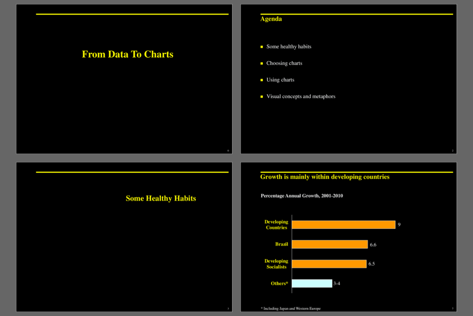
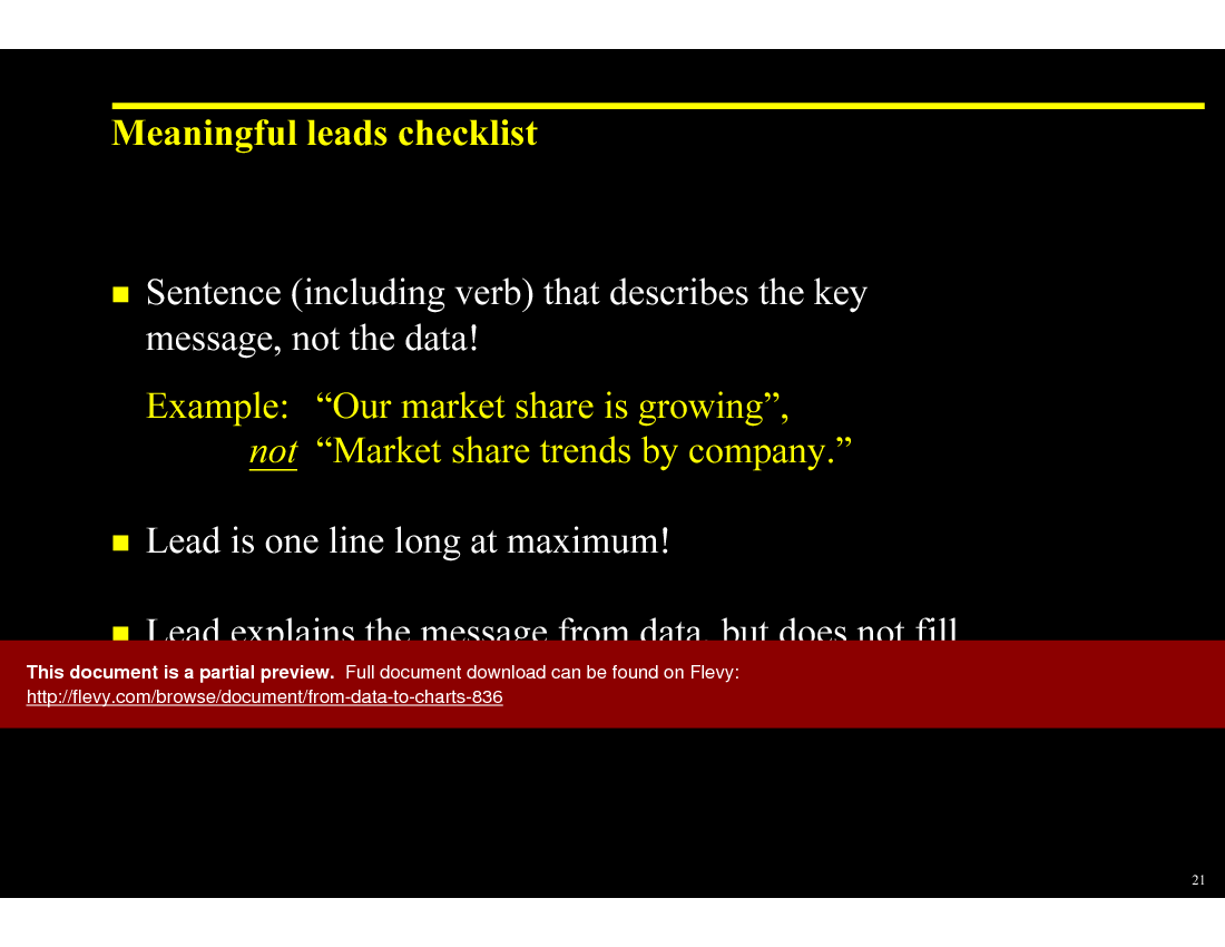
This presentation also dives into effective data visualization techniques, ensuring your message is not just heard, but seen clearly. It covers how to leverage different types of charts, from pie charts to histograms, to best represent your data. The document emphasizes the importance of selecting the right chart type based on the data and the message you want to convey. It’s not just about showing numbers; it’s about telling a story with your data.

You’ll find detailed explanations on how to avoid common pitfalls in data presentation, such as overusing pie charts or creating overly complex line charts. The presentation provides practical tips on using color and scale to highlight key points and make your charts more impactful. It’s about making your data work for you, not against you.

The toolkit also includes strategies for dealing with data from different sources and ensuring consistency in your visuals. It guides you through the process of combining various data sets into a cohesive presentation that supports your overall narrative. This is crucial for maintaining credibility and ensuring your audience stays engaged.

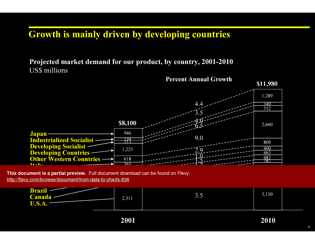
The presentation offers a variety of templates and examples to help you get started. Whether you’re presenting sales trends, market analysis, or operational metrics, this document provides the tools you need to create compelling visuals. It’s designed to save you time and help you deliver presentations that are both informative and visually appealing.

Got a question about the product? Email us at support@flevy.com or ask the author directly by using the "Ask the Author a Question" form. If you cannot view the preview above this document description, go here to view the large preview instead.

MARCUS OVERVIEW

This synopsis was written by Marcus [?] based on the analysis of the full 114-slide presentation.


Executive Summary
This presentation, "From Data to Charts," is a consulting-grade toolkit designed to enhance data visualization skills, reflecting the quality expected from McKinsey, Bain, or BCG (not affiliated). It equips corporate executives, integration leaders, and consultants with the knowledge to effectively communicate complex data through visual storytelling. Users will learn to select appropriate chart types, simplify messages, and avoid common pitfalls in data presentation, ultimately leading to more impactful business communications.

Who This Is For and When to Use
•  Corporate executives seeking to improve presentation effectiveness
•  Integration leaders responsible for conveying complex data insights
•  Consultants aiming to enhance client presentations with visual aids
•  Marketing and sales teams needing to present data-driven strategies

Best-fit moments to use this deck:
•  During strategic planning sessions to visualize market trends
•  In client meetings to present data-driven recommendations
•  For training workshops focused on improving presentation skills
•  When developing reports that require clear data visualization

Learning Objectives
•  Define key principles of effective data visualization
•  Build impactful presentations using appropriate chart types
•  Establish a clear message for each data chart
•  Identify common pitfalls in data presentation and how to avoid them
•  Create a checklist for maintaining simplicity in charts
•  Develop skills to analyze data and derive meaningful insights for presentations

Table of Contents
•  Healthy Habits (page 3)
•  Choosing Charts (page 12)
•  Using Charts (page 41)
•  Visual Concepts and Metaphors (page 86)

Primary Topics Covered
•  Healthy Habits - Guidelines for simplifying charts and avoiding information overload to enhance clarity and engagement.
•  Choosing Charts - A structured approach to selecting the right chart based on the intended message and comparison type.
•  Using Charts - Techniques for effectively presenting different types of comparisons, including components, items, and trends.
•  Visual Concepts and Metaphors - Exploration of visual metaphors to enhance understanding and retention of data presentations.

Deliverables, Templates, and Tools
•  Chart selection framework to guide users in choosing the appropriate chart type
•  Healthy habits checklist for effective data presentation
•  Templates for common chart forms, including pie, bar, and line charts
•  Visual concept examples to inspire creative presentation designs

Slide Highlights
•  "Healthy Habits" slide emphasizing the importance of simplicity in charts
•  "Choosing Charts" slide outlining the 3 steps to effective chart selection
•  "Using Charts" slide demonstrating various comparison types with visual examples
•  "Visual Concepts and Metaphors" slide showcasing creative ways to represent data visually

Potential Workshop Agenda
Introduction to Data Visualization (30 minutes)
•  Overview of key principles and importance of effective data presentation
•  Discussion on common pitfalls and how to avoid them

Chart Selection Workshop (60 minutes)
•  Hands-on activity to practice choosing the right chart type for different messages
•  Group feedback on chart selections and improvements

Presentation Skills Enhancement (60 minutes)
•  Techniques for simplifying messages and enhancing visual appeal
•  Role-playing exercises to practice presenting data effectively

Customization Guidance
•  Tailor the checklist for healthy habits to fit specific organizational needs
•  Adapt chart selection frameworks to align with industry-specific data types
•  Incorporate company branding into chart templates for consistency

Secondary Topics Covered
•  Importance of audience engagement in presentations
•  Techniques for storytelling with data
•  The role of color and design in enhancing chart effectiveness
•  Strategies for integrating visuals into written reports

Topic FAQ

What are the core principles of effective data visualization I should follow when preparing a business presentation?

Effective data visualization emphasizes simplicity, clarity, and choosing the chart type that directly supports a single message without overwhelming the audience. Presenters should limit data points, use legible fonts, and highlight the key takeaway; the toolkit addresses these through a Healthy Habits checklist.

How should I decide between using a pie chart, bar chart, or line chart for different comparisons?

Start by defining the message and the comparison type—components, items, or trends—then pick the form that maps to that comparison. The product provides a chart selection framework and templates that recommend pie charts for components, bar charts for item comparisons, and line charts for time series.

What common chart-making mistakes reduce audience comprehension during presentations?

Common mistakes include overcrowded charts, excessive explanatory text, multiple competing chart types on one slide, and failing to state a clear takeaway. The presentation highlights avoiding information overload and stresses one key message per chart, reinforced in the Healthy Habits slide.

If I have limited prep time, what features in a visualization toolkit save the most effort?

Prebuilt, customizable chart templates, a checklist to validate clarity, and concise guidance on chart selection reduce prep time. From Data to Charts lists templates for pie, bar, and line charts, plus customization guidance for branding to speed slide creation.

How much practical benefit do prebuilt chart templates provide compared with building visuals from scratch?

Prebuilt templates provide structured starting points, reduce repetitive formatting work, and illustrate recommended chart forms for common comparisons like market trends or operational metrics. The author notes templates and examples help save time and support presentations for sales trends, market analysis, and operational metrics.

I want to run a half-day training on data visualization—what agenda elements should I include?

A concise agenda includes an introduction to data visualization (principles and pitfalls, ~30 minutes), a hands-on chart selection workshop (practicing chart choices, ~60 minutes), and presentation skills exercises for simplifying and delivering charts (role-playing, ~60 minutes), matching the suggested 30/60/60 agenda.

How do visual metaphors help audiences understand complex business data?

Visual metaphors map abstract concepts to familiar imagery, aiding comprehension and recall by making relationships and themes more relatable. The toolkit explores Visual Concepts and Metaphors to illustrate ways to represent complex ideas and improve retention via relatable visuals in the Visual Concepts and Metaphors section.

What components are typically included in a chart selection framework for business presentations?

A chart selection framework guides users to define the message, identify the comparison type (components, items, trends), and apply rules that map those choices to suitable chart forms. From Data to Charts outlines a structured, 3-step approach on its "Choosing Charts" slide.

Document FAQ
These are questions addressed within this presentation.

What are the key principles of effective data visualization?
Effective data visualization focuses on simplicity, clarity, and the appropriate use of chart types to convey a specific message without overwhelming the audience.

How do I choose the right chart for my data?
Start by determining the message you want to convey, identify the type of comparison needed, and then select the chart form that best represents that comparison.

What common mistakes should I avoid in data presentations?
Avoid cluttered charts, excessive text, and using too many chart types in one presentation. Focus on one key message per chart.

How can I simplify my charts?
Use a checklist to ensure clarity: limit the number of data points, use larger font sizes, and highlight key messages.

What types of charts are best for different comparisons?
Use pie charts for components, bar charts for item comparisons, line charts for time series, and dot charts for correlation comparisons.

How can I enhance audience engagement during presentations?
Incorporate storytelling techniques, ask questions, and use visuals that resonate with the audience to maintain interest.

What is the significance of visual metaphors in presentations?
Visual metaphors help convey complex ideas in a relatable way, making data easier to understand and remember.

How can I ensure my charts are visually appealing?
Utilize color effectively, maintain consistent design elements, and ensure that charts are not overcrowded with information.

Glossary
•  Data Visualization - The graphical representation of information and data.
•  Chart Type - The format used to display data, such as bar, line, or pie charts.
•  Comparison - The relationship between different data points or categories.
•  Information Overload - A state where the amount of information exceeds an individual's ability to process it.
•  Visual Metaphor - A visual representation that symbolizes a concept or idea.
•  Audience Engagement - The level of interaction and involvement of the audience during a presentation.
•  Simplicity - The quality of being easy to understand or do; essential in effective data presentation.
•  Storytelling - The art of using narrative to convey information in a compelling way.
•  Clarity - The quality of being clear and easy to understand, crucial in presentations.
•  Color Theory - The study of how colors interact and the effects they have on viewers.
•  Font Size - The size of text in a presentation, which should be large enough to be legible from a distance.
•  Key Message - The main point or takeaway that a presenter wants the audience to remember.
•  Data Point - An individual piece of data used in analysis and visualization.
•  Engagement Techniques - Strategies used to capture and maintain audience interest.
•  Design Elements - Components such as color, layout, and typography that contribute to the overall look of a presentation.
•  Presentation Skills - The abilities required to effectively deliver information to an audience.
•  Clutter - Excessive information or design elements that distract from the main message.
•  Visual Appeal - The aesthetic quality of a presentation that attracts and holds audience attention.
•  Chart Selection Framework - A guide to help determine the most effective chart type for specific data comparisons.
•  Healthy Habits Checklist - A list of best practices for creating effective data visualizations.
•  Template - A pre-designed format for charts or presentations that can be customized.

Source: Best Practices in Presentation Development PowerPoint Slides: From Data to Charts PowerPoint (PPT) Presentation Slide Deck, Documents & Files


$109.99

Add to Cart
  

ABOUT THE AUTHOR

Additional documents from author: 130

Ask the Author a Question

You must be logged in to contact the author.

Click here to log in Click here register

Did you know?
The average daily rate of a McKinsey consultant is $6,625 (not including expenses). The average price of a Flevy document is $65.
Bundle and save! You can save up to % with bundles!

View bundle(s)


Trusted by over 10,000+ Client Organizations
Since 2012, we have provided business templates to over 10,000 businesses and organizations of all sizes, from startups and small businesses to the Fortune 100, in over 130 countries.
AT&T GE Cisco Intel IBM Coke Dell Toyota HP Nike Samsung Microsoft Astrazeneca JP Morgan KPMG Walgreens Walmart 3M Kaiser Oracle SAP Google E&Y Volvo Bosch Merck Fedex Shell Amgen Eli Lilly Roche AIG Abbott Amazon PwC T-Mobile Broadcom Bayer Pearson Titleist ConEd Pfizer NTT Data Schwab


Read Customer Testimonials

 
"My FlevyPro subscription provides me with the most popular frameworks and decks in demand in today’s market. They not only augment my existing consulting and coaching offerings and delivery, but also keep me abreast of the latest trends, inspire new products and service offerings for my practice, and educate me "

– Bill Branson, Founder at Strategic Business Architects
 
"Flevy.com has proven to be an invaluable resource library to our Independent Management Consultancy, supporting and enabling us to better serve our enterprise clients.

The value derived from our [FlevyPro] subscription in terms of the business it has helped to gain far exceeds the investment made, making a subscription a no-brainer for any growing consultancy – or in-house strategy team."

– Dean Carlton, Chief Transformation Officer, Global Village Transformations Pty Ltd.
 
"FlevyPro has been a brilliant resource for me, as an independent growth consultant, to access a vast knowledge bank of presentations to support my work with clients. In terms of RoI, the value I received from the very first presentation I downloaded paid for my subscription many times over! The "

– Roderick Cameron, Founding Partner at SGFE Ltd
 
"Last Sunday morning, I was diligently working on an important presentation for a client and found myself in need of additional content and suitable templates for various types of graphics. Flevy.com proved to be a treasure trove for both content and design at a reasonable price, considering the time I "

– M. E., Chief Commercial Officer, International Logistics Service Provider
 
"I am extremely grateful for the proactiveness and eagerness to help and I would gladly recommend the Flevy team if you are looking for data and toolkits to help you work through business solutions."

– Trevor Booth, Partner, Fast Forward Consulting
 
"As a young consulting firm, requests for input from clients vary and it's sometimes impossible to provide expert solutions across a broad spectrum of requirements. That was before I discovered Flevy.com.

Through subscription to this invaluable site of a plethora of topics that are key and crucial to consulting, I "

– Nishi Singh, Strategist and MD at NSP Consultants
 
"FlevyPro provides business frameworks from many of the global giants in management consulting that allow you to provide best in class solutions for your clients."

– David Harris, Managing Director at Futures Strategy
 
"I like your product. I'm frequently designing PowerPoint presentations for my company and your product has given me so many great ideas on the use of charts, layouts, tools, and frameworks. I really think the templates are a valuable asset to the job."

– Roberto Fuentes Martinez, Senior Executive Director at Technology Transformation Advisory


Save with Bundles

This document is available as part of the following discounted bundle(s):

Save %!
Essential Consulting Skill Builder

This bundle contains 19 total documents. See all the documents to the right.

$499.99


Add Bundle & Save


Customers Also Bought These Documents


Customers Also Like These Documents

Explore Templates on Related Management Topics


Your Recently Viewed Documents
Receive our FREE whitepaper on the Top 101 Consulting Frameworks

Download our 200+ page guide summarizing the Top 101 Management Consulting Frameworks. Each framework provides a structured approach to analyzing and solving a common business problem.