Seven Basic Tools of Quality – PowerPoint PPTX Template
PowerPoint (PPTX) 90 Slides
BENEFITS OF THIS DOWNLOADABLE POWERPOINT DOCUMENT
- Provides procedures and practical tips for using the basic quality tools for problem solving.
- Provides problem solving teams with the ability to see through the murky water so that they can focus on the facts.
- Provides guidance on how to present your data visually to help the audience to better understand the problem.
PPT TEMPLATE DESCRIPTION
The Seven Basic Tools of Quality is a designation given to a fixed set of graphical techniques identified as being most helpful in troubleshooting issues related to quality. They are called basic because they are suitable for people with little formal training in statistics and because they can be used to solve the vast majority of quality-related issues.
The Seven Basic Tools of Quality or 7 Basic QC Tools as they are commonly called, are tools which arrange problem areas, put data into diagrams, surface problem areas and clearly bring up any hidden truth. These tools are not for experts alone but for the use of everyone in their daily work. A problem solving team's successes are dependent on the familiarity and ease with which these tools are used.
The 7 Basic QC Tools are:
1. Check Sheet: Systematically collects and organizes data for analysis.
2. Histogram: Illustrates the distribution of a set of data.
3. Pareto Chart: Identifies and prioritizes the most significant factors contributing to a problem.
4. Cause-and-Effect Diagram (Fishbone/Ishikawa): Identifies potential causes of a problem for further analysis.
5. Scatter Diagram: Examines the relationship between two variables.
6. Control Chart: Monitors and maintains the stability of a process over time.
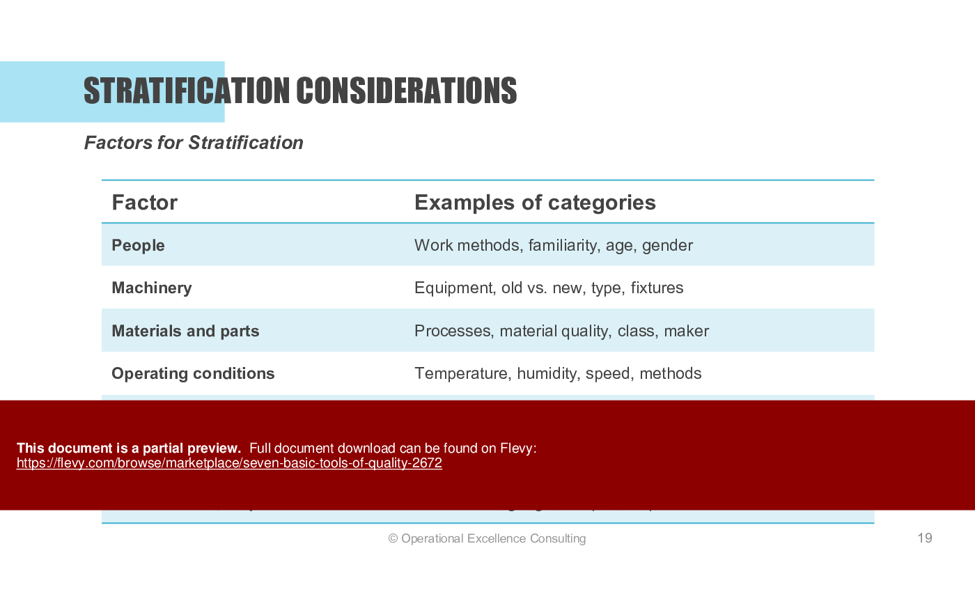
7. Stratification: Analyzes and categorizes data to identify patterns and variations.
In this training presentation, you will be able to teach employees how to use the tools in their daily work or as part of the structured Plan-Do-Check-Act (PDCA) approach to problem solving. The basic tools can also be applied in A3 problem solving, 8D (Eight Disciplines) problem solving, Yellow/Green Belt Lean Six Sigma projects, Kaizen events, TPM Focused Improvement projects, etc.
LEARNING OBJECTIVES
1. To understand the seven basic tools for quality and process improvement.
2. To learn how to apply the seven basic tools of quality to problem solving or daily work.
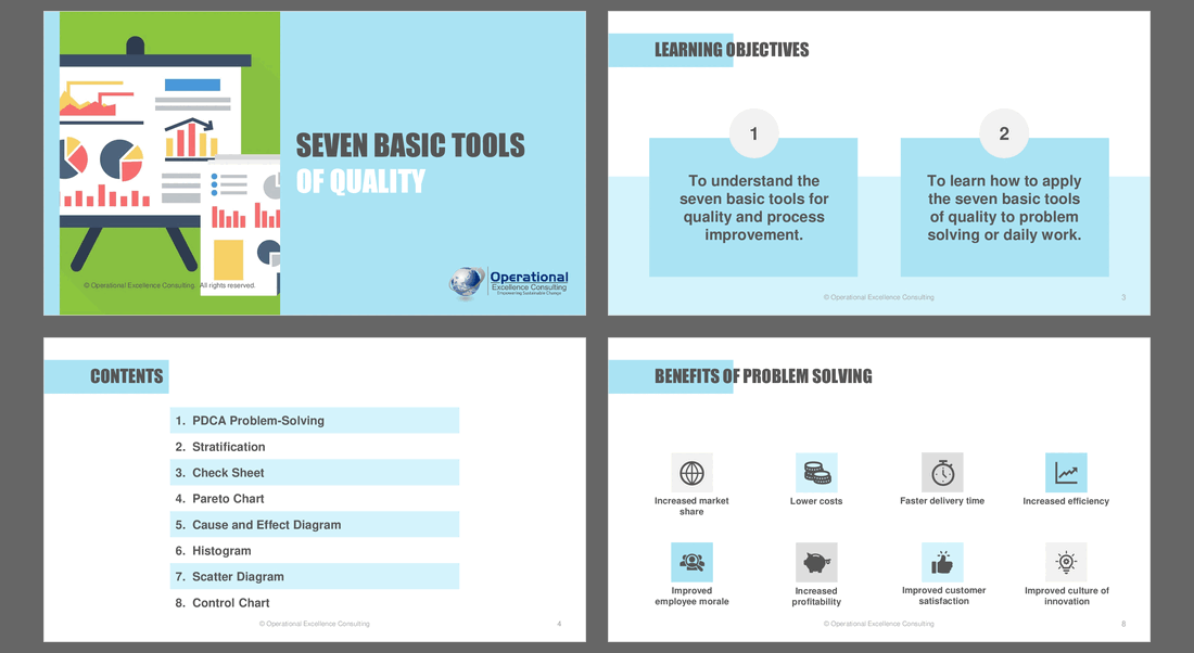
CONTENTS
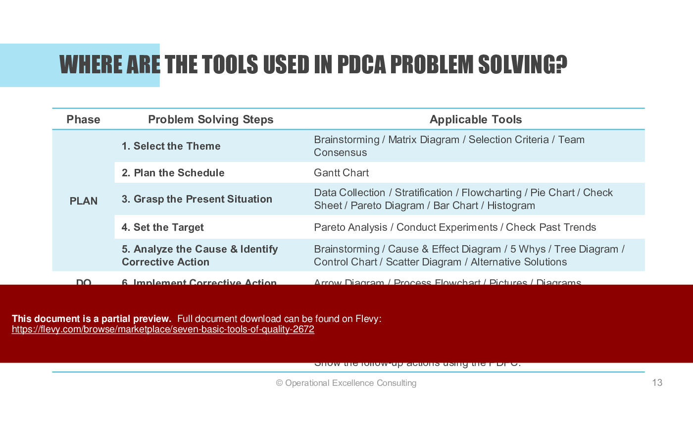
1. PDCA Problem Solving
2. Stratification
3. Check Sheet
4. Control Chart
5. Pareto Chart
6. Cause & Effect Diagram
7. Histogram
8. Scatter Diagram
Got a question about the product? Email us at support@flevy.com or ask the author directly by using the "Ask the Author a Question" form. If you cannot view the preview above this document description, go here to view the large preview instead.
PRESENTATION DEEP DIVE ANALYSIS
This deep-dive analysis was generated from the full 90-slide PowerPoint presentation.
Executive Summary
The "Seven Basic Tools of Quality" presentation is a robust training resource designed to enhance understanding and application of essential quality improvement methodologies. Developed by Operational Excellence Consulting, this presentation equips users with practical knowledge on the 7 fundamental tools that facilitate effective problem-solving and process enhancement. Users will learn to implement these tools in various operational contexts, leading to improved quality control, increased efficiency, and enhanced customer satisfaction.
Who This Is For and When to Use
• Quality Assurance Managers seeking to improve process efficiency
• Operations Managers focused on quality control and continuous improvement
• Team Leaders involved in problem-solving initiatives
• Training Coordinators responsible for staff development in quality management
Best-fit moments to use this deck:
• During quality improvement training sessions
• When implementing Lean or Total Quality Management (TQM) initiatives
• For workshops aimed at enhancing problem-solving skills within teams
Learning Objectives
• Define the 7 basic tools for quality and process improvement
• Apply the 7 basic tools of quality to real-world problem-solving scenarios
• Analyze data effectively using quality tools to identify trends and issues
• Develop actionable plans for quality improvement based on tool insights
• Foster a culture of continuous improvement within teams
Table of Contents
• PDCA Problem-Solving (page 5)
• Stratification (page 16)
• Check Sheet (page 23)
• Pareto Chart (page 29)
• Cause and Effect Diagram (page 42)
• Histogram (page 54)
• Scatter Diagram (page 61)
• Control Chart (page 69)
Primary Topics Covered
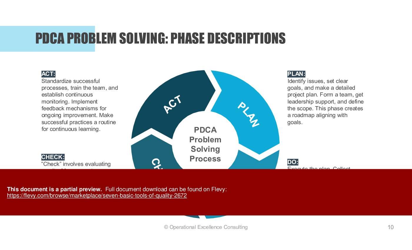
• PDCA Problem-Solving - A structured approach to problem-solving using the Plan-Do-Check-Act methodology, emphasizing continuous improvement.
• Stratification - A technique for categorizing data to uncover patterns and variations, aiding in root cause analysis.
• Check Sheet - A tool for systematically collecting and recording data to track issues and occurrences.
• Pareto Chart - A visual representation that identifies the most significant factors contributing to a problem, based on the 80/20 rule.
• Cause and Effect Diagram - Also known as the Fishbone Diagram, this tool helps visualize relationships between causes and effects, facilitating collaborative problem-solving.
• Histogram - A graphical representation of data distribution that helps identify trends and patterns over defined intervals.
• Scatter Diagram - A plot that visualizes relationships between 2 variables, aiding in identifying correlations and trends.
• Control Chart - A statistical tool used to monitor process stability and control quality over time, identifying variations and trends.
Deliverables, Templates, and Tools
• PDCA Problem-Solving template for structured project planning
• Stratification analysis framework for data categorization
• Check Sheet template for tracking defect occurrences
• Pareto Chart template for prioritizing issues
• Cause and Effect Diagram template for root cause analysis
• Histogram template for visualizing data distribution
• Scatter Diagram template for analyzing variable relationships
• Control Chart template for monitoring process performance
Slide Highlights
• Overview of the PDCA cycle and its application in problem-solving
• Visual examples of stratification and its impact on quality improvement
• Step-by-step guide for creating a Pareto Chart with illustrative data
• Detailed explanation of the Cause and Effect Diagram with real-world examples
• Practical tips for effective use of Check Sheets and Histograms
Potential Workshop Agenda
Introduction to Quality Tools (30 minutes)
• Overview of the 7 basic tools
• Discussion on the importance of quality in operations
Hands-On PDCA Problem-Solving Session (60 minutes)
• Group activity to apply PDCA methodology
• Identify a real problem and develop a plan
Stratification and Data Analysis Workshop (45 minutes)
• Practical exercise on data segmentation
• Analyze results and discuss findings
Creating and Interpreting Quality Tools (60 minutes)
• Hands-on creation of Check Sheets, Pareto Charts, and Control Charts
• Group presentations on findings and insights
Customization Guidance
• Tailor the presentation to include specific industry examples relevant to your organization
• Adjust the case studies and exercises to reflect current challenges faced by your team
• Incorporate company-specific terminology and metrics for better alignment
Secondary Topics Covered
• The role of quality tools in Lean and TQM methodologies
• Best practices for data collection and analysis
• Techniques for fostering a culture of continuous improvement
• Strategies for effective team collaboration in problem-solving
Topic FAQ
What are the Seven Basic Tools of Quality and why are they taught together?
The Seven Basic Tools of Quality are graphical techniques used to troubleshoot quality issues without advanced statistics: Check Sheet, Histogram, Pareto Chart, Cause-and-Effect (Fishbone), Scatter Diagram, Control Chart, and Stratification. They are taught together because they collectively enable data collection, visualization, root-cause identification, and monitoring across typical quality problems, covering 7 basic tools.How does the PDCA cycle integrate with quality tools in problem solving?
PDCA (Plan-Do-Check-Act) provides a structured four-step workflow where teams plan interventions, apply tools to collect and analyze data (Check Sheet, Pareto, Histogram), evaluate results (Control Chart), and adjust actions. The training presentation places PDCA at the center of applying the 7 tools in real-world problem-solving, using the PDCA template.When is it most appropriate to use a Pareto Chart in quality work?
Use a Pareto Chart to identify and prioritize the most significant contributors to a problem by frequency or impact so resources focus on the few vital causes. The presentation demonstrates creating Pareto Charts with illustrative data to support prioritization during improvement initiatives, using the Pareto Chart template.What is the primary purpose of a Control Chart in ongoing operations?
A Control Chart monitors process stability and detects special-cause versus common-cause variation over time, enabling teams to see when corrective action is required. The deck explains interpretation and use of Control Charts for ongoing quality control and trend identification, focusing on process stability with a Control Chart template.How should I assess the value of buying template-based quality training materials?
Evaluate whether the resource includes practical templates (Check Sheet, Pareto, Control Chart), workshop agendas, step-by-step examples, and customization guidance that match your training goals and team skill level. The product’s inclusion of templates, workshop agenda, and customization notes helps assess applicability and training value, including Pareto and Control Chart templates.Can these basic QC tools be used in Lean Six Sigma or certification projects?
Yes; the 7 graphical tools are suitable for teams with minimal statistical training and can be applied within A3 problem solving, 8D, Yellow/Green Belt Lean Six Sigma projects, Kaizen events, and TPM focused-improvement efforts, as noted in the presentation’s author guidance covering A3, 8D, Yellow/Green Belt, and Kaizen events.My team needs a simple method to collect defect data on the shop floor—what should we use?
Start with a Check Sheet to define the event, create operational definitions, set a collection timeframe, and design an easy form for recording occurrences; then analyze frequencies with a Pareto Chart or Histogram. The presentation provides a Check Sheet template and step-by-step creation guidance for Check Sheets.After a process consolidation, we see more variation—which tools help diagnose causes?
Use Stratification to segment data and reveal patterns, Histograms to view distribution and shifts, Scatter Diagrams to test relationships between variables, and Cause-and-Effect diagrams to structure root-cause brainstorming. The training deck covers Stratification and Histogram techniques with templates for both.Document FAQ
These are questions addressed within this presentation.
What are the 7 basic tools of quality?
The 7 basic tools of quality include PDCA Problem-Solving, Stratification, Check Sheet, Pareto Chart, Cause and Effect Diagram, Histogram, Scatter Diagram, and Control Chart.
How can I apply these tools in my organization?
These tools can be integrated into quality improvement initiatives, training programs, and daily operations to enhance problem-solving capabilities and process efficiency.
What is the PDCA cycle?
The PDCA cycle stands for Plan-Do-Check-Act, a four-step methodology for continuous improvement in processes and problem-solving.
When should I use a Pareto Chart?
Use a Pareto Chart when you need to identify the most significant issues affecting quality or performance, allowing you to focus resources effectively.
How do I create a Check Sheet?
Identify the event to observe, create operational definitions, determine the data collection timeframe, and design a simple form for easy recording.
What is a Cause and Effect Diagram?
A Cause and Effect Diagram, also known as a Fishbone Diagram, helps visualize the relationships between potential causes and their effects, facilitating root cause analysis.
How can I use a Histogram?
A Histogram can be used to visualize the distribution of data, identify patterns, and compare frequencies within defined intervals.
What is the purpose of a Control Chart?
A Control Chart is used to monitor process stability and quality over time, helping to identify variations and trends that may require corrective action.
Glossary
• PDCA - Plan-Do-Check-Act; a continuous improvement methodology.
• Stratification - The process of categorizing data to identify patterns.
• Check Sheet - A tool for recording data systematically.
• Pareto Chart - A chart that identifies the most significant factors contributing to a problem.
• Cause and Effect Diagram - A visual tool for identifying relationships between causes and effects.
• Histogram - A graphical representation of data distribution.
• Scatter Diagram - A plot that visualizes the relationship between 2 variables.
• Control Chart - A tool for monitoring process stability and quality over time.
• Quality Improvement - Efforts aimed at enhancing processes and outcomes.
• Root Cause Analysis - The process of identifying the underlying causes of problems.
• Continuous Improvement - Ongoing efforts to enhance products, services, or processes.
• Data Segmentation - Dividing data into distinct categories for analysis.
• Trend Analysis - The practice of collecting and analyzing data to identify patterns over time.
• Quality Control - The process of ensuring that products and services meet specified requirements.
• Process Optimization - The practice of making adjustments to improve efficiency and effectiveness.
Source: Seven Basic Tools of Quality PowerPoint (PPTX) Presentation Slide Deck, Operational Excellence Consulting
ABOUT THE AUTHOR
Operational Excellence Consulting, founded in 2009 by Allan Ung, draws from extensive experience at Microsoft, IBM, and Underwriters Laboratories (UL). We specialize in strategy deployment, customer experience design, and operational excellence, applying Design Thinking, Lean, and Systems Thinking to maximize customer value and minimize waste.
Our
... [read more]
Ask the Author a Question
You must be logged in to contact the author.
This document is available as part of the following discounted bundle(s):
Save %!
Basic & Advanced Tools of Quality ("QC Tools")
This bundle contains 2 total documents. See all the documents to the right.
