This framework is developed by a team of former McKinsey and Big 4 consultants. The presentation follows the headline-body-bumper slide format used by global consulting firms.
This product (Product Management KPIs) is a 32-slide PPT PowerPoint presentation slide deck (PPTX), which you can download immediately upon purchase.
Product Managers are responsible for defining the features or functions of a Product and for overseeing the development of the Product. The role of Produce Managers spans many activities from strategic to tactical and can vary based on the organizational structure of the organization.
Typically, Product Leaders are involved with the entire Product Lifecycle. However, the Product Management's primary focus is on driving New Product Development.
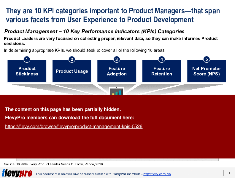
To successfully execute these roles, it's important for Product Management to collect and synthesize proper, relevant data to make informed Product decisions.
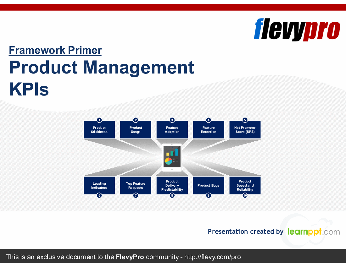
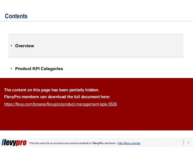
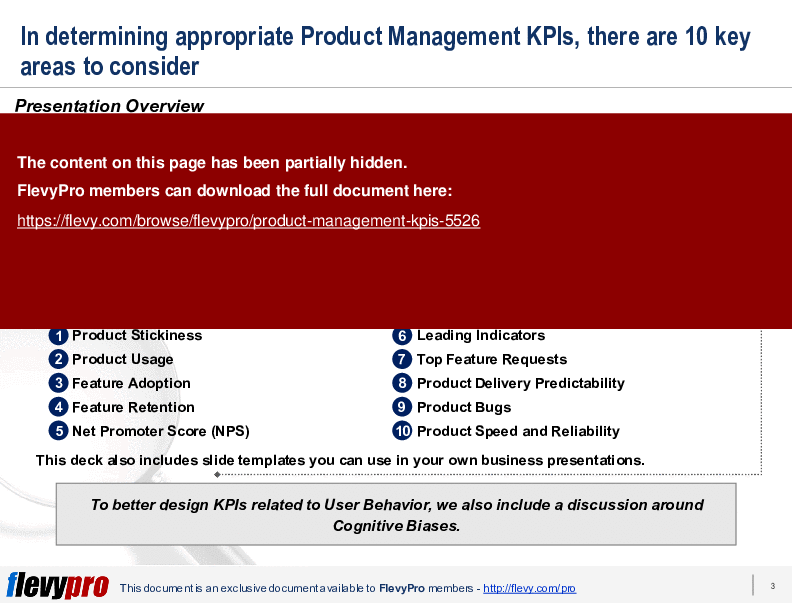
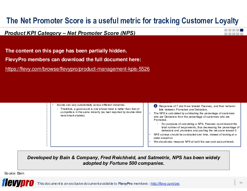
In this presentation, we discuss 10 categories of Key Performance Indicators (KPIs) that Product Management should be evaluating. These areas range from Product Stickiness to Net Promoter Score (NPS) to Leading Indicators.
To better design KPIs related to User Behavior, we also include a discussion around Cognitive Biases.
This deck also includes slide templates you can use in your own business presentations.
This presentation provides a comprehensive guide to the essential KPIs that Product Managers need to monitor for optimal product performance. It covers critical areas such as Product Stickiness, Feature Adoption, and Net Promoter Score, ensuring that you have a robust framework for evaluating product success. The inclusion of Cognitive Biases offers a nuanced understanding of user behavior, which is crucial for designing effective KPIs.
The deck is designed to be practical and actionable, with slide templates that can be directly applied to your business presentations. It emphasizes the importance of data-driven decision-making and provides detailed explanations on how to measure and interpret each KPI. This resource is invaluable for Product Leaders aiming to enhance their product management strategies and drive better business outcomes.
This PPT slide presents a clear example of tracking feature adoption over time, focusing on 2 specific features labeled A and B. The graph illustrates the percentage of accounts utilizing these features across eight quarters, from Q1 to Q8. Notably, the adoption rates exhibit fluctuations, with Feature A showing a peak in Q2 before experiencing a decline. This decline appears to stabilize around the 40% mark in subsequent quarters.
The text accompanying the graph emphasizes the importance of setting goals based on observed data. It suggests aiming for an initial adoption rate between 45% and 50%, with an anticipated drop of about 10% following the promotional period. This insight is crucial for executives looking to establish realistic benchmarks for feature adoption, as it highlights the typical trajectory of user engagement post-launch.
The slide also indicates that while initial adoption may be high, sustained engagement requires ongoing efforts. The gradual increase in adoption rates after the initial drop suggests that users may need time to fully integrate new features into their workflows. This pattern underscores the necessity for continuous monitoring and potential adjustments to strategies aimed at enhancing user experience and feature utilization.
Overall, this slide serves as a practical tool for executives to understand how to measure and interpret feature adoption metrics. It provides actionable insights that can inform future product development and marketing strategies, making it a valuable resource for decision-makers.
This PPT slide focuses on the importance of tracking Key Performance Indicators (KPIs) related to product delivery predictability. It emphasizes that earlier KPIs primarily measured user behavior, while product delivery predictability serves as an internal metric assessing the performance of the Product Team. The absence of these metrics could jeopardize the reliability of the Product Roadmap, which is essential for guiding the team’s efforts.
The Product Roadmap is described as a critical document that outlines the vision, direction, priorities, and progress of a product. It acts as a shared source of truth for the organization, aligning short- and long-term goals. The roadmap serves as a plan of action, ensuring that all stakeholders are on the same page regarding the product's trajectory.
In terms of measurement, the slide lists several conventional Project Management metrics that can be applied to the Product Roadmap. These include the completion of key milestones, key deliverables, workstreams, unit tests, and features. Each of these elements provides a tangible way to assess adherence to the roadmap and overall project execution.
The slide also hints at a visual representation of these KPIs, likening them to traffic lights that indicate whether the project is on schedule, behind schedule, or ahead of schedule. This visual approach can simplify the understanding of product delivery predictability, making it easier for stakeholders to gauge progress and make informed decisions. Overall, the content underscores the necessity of robust metrics to ensure the success of product development initiatives.
This PPT slide focuses on the Net Promoter Score (NPS) as a key performance indicator for assessing customer loyalty and predicting growth. It begins with an overview that defines NPS as a straightforward metric that aids organizations in measuring and managing customer loyalty. The slide presents a critical question: whether users would recommend the company's product or service to others, which serves as the foundation for the NPS calculation.
In the details section, the slide references Bain & Company, highlighting their role in developing the NPS methodology. It cites specific results from organizations that have successfully integrated NPS into their product management strategies, including a notable reduction in customer attrition by 20%, doubling industry revenue, and achieving NPS gains of over 10 points in the first year. Additionally, it mentions a cost advantage of 15%, suggesting that effective NPS implementation can lead to significant financial benefits.
The measurement section explains how the NPS is calculated based on survey responses to a single question regarding the likelihood of recommending the product. Respondents are categorized into 3 groups: Promoters (scores of 9-10), Passives (scores of 7-8), and Detractors (scores of 0-6). The slide emphasizes that a good NPS score is relative to competitors within the same industry, indicating the importance of benchmarking.
Overall, this slide provides a clear framework for understanding NPS, its implications for customer loyalty, and its potential impact on business outcomes. It serves as a valuable resource for organizations looking to enhance their customer engagement strategies and drive growth.
This PPT slide focuses on the importance of Key Performance Indicators (KPIs) related to top feature requests in product management. It highlights a critical question: whether users are aligned in their expectations from the product. The content is structured into 3 main sections: Overview, Details, and Measurement.
The Overview section establishes the objective of these KPIs, which is to identify features that are in high demand among users. This prioritization is essential for effective product development. The Details section explains the challenges faced by Product Managers, who often deal with a significant volume of feature requests coming from various channels like email, live chat, and support tickets. It notes that these requests can be both qualitative and quantitative, necessitating a systematic approach to analyze them.
The Measurement section emphasizes the need for a centralized system to identify and select top feature requests. This system should enable the analysis of requests at both user and account levels, helping to visualize patterns that inform prioritization. The slide suggests that understanding these patterns can lead to better decision-making regarding product features and enhancements, ultimately benefiting the broader user base.
The final note underscores the importance of keeping users informed about the progress of their feature requests, which is crucial for maintaining engagement and trust. Overall, the slide presents a structured approach to managing feature requests, emphasizing the need for systematic analysis and user communication.
This PPT slide presents an overview of 3 cognitive biases that significantly impact decision-making processes. The first bias discussed is "Sample Size Neglect," which highlights a common fallacy where individuals draw conclusions from insufficient data. It emphasizes that meaningful statistical inferences require a sufficiently large sample size. This bias can lead to erroneous decisions, as people may overestimate the validity of their conclusions based on limited information.
Next, the slide addresses "Hindsight Bias." This bias describes the tendency for individuals to believe they could have predicted an outcome after it has occurred. The example provided references the Great Recession of 2008, where analysts retrospectively identified trivial events as indicators of impending financial trouble. This illustrates how hindsight bias can distort perceptions of past events and lead to overconfidence in forecasting abilities.
The final bias covered is "Anchoring & Adjustment." This bias occurs when an initial number or value serves as a reference point, influencing subsequent judgments and decisions. The example of a used car salesman illustrates this concept well, as the initial high price set by the salesman serves as an anchor, potentially skewing the buyer's perception of what constitutes a fair price.
Overall, the slide underscores the importance of recognizing these cognitive biases in order to enhance decision-making. Understanding how these biases operate can lead to more informed choices and improved outcomes in both personal and professional contexts.
This PPT slide focuses on the intersection of behavioral psychology and key performance indicators (KPIs) related to user behavior. It emphasizes the importance of understanding cognitive biases when designing these KPIs. Cognitive biases can significantly affect how users make decisions, which in turn influences their behavior regarding product adoption and retention.
The content outlines 2 primary types of cognitive biases: cognitive and emotional. These biases stem from incomplete information or the inability to analyze data effectively. The slide categorizes these biases into 2 groups: Belief Persistence and Processing Errors. Belief Persistence refers to the tendency of individuals to resist changing their beliefs, even when faced with contradictory information. Processing Errors relate to failures in organizing or analyzing data, which can lead to misguided conclusions.
A visual representation lists nine common cognitive biases, including Framing Bias, Availability Bias, and Confirmation Bias, among others. Each bias is numbered and visually connected to a central figure, suggesting their relevance to decision-making processes. This layout not only highlights the biases, but also indicates their interconnected nature.
The concluding statement stresses the necessity of understanding and mitigating these biases. It suggests that educating decision-makers on these biases can lead to more rational and logical decision-making. This insight is particularly valuable for organizations aiming to refine their approach to user engagement and product management. Understanding these psychological factors can ultimately enhance the effectiveness of KPIs designed to track user behavior.
This PPT slide focuses on the importance of establishing Key Performance Indicators (KPIs) related to Product Stickiness, which measures user engagement with a product. It begins with an overview that emphasizes the necessity of these KPIs to determine whether users are consistently re-engaging with the product. The key question posed is straightforward: Are users returning to use the product?
The details section elaborates on the concept of stickiness, defining it as a characteristic of successful products. A product that exhibits stickiness means users are not only signing up, but are also actively using it as part of their daily routines. It warns against the pitfalls of attracting new users without retaining them, pointing out that this situation can lead to wasted marketing efforts and financial strain, especially for startups under pressure to grow.
Measurement methods are outlined next. The primary metric for gauging Product Stickiness is the ratio of Daily Active Users (DAU) to Monthly Active Users (MAU). This metric provides insight into the percentage of monthly users who engage with the product daily. Additionally, a similar metric using Weekly Active Users (WAU) against MAU is mentioned, reinforcing the idea that higher ratios indicate greater user stickiness.
The slide concludes with a reminder of the critical role that Product Managers play in understanding these metrics. They need to grasp what influences these scores to make informed decisions about product improvements and user engagement strategies. This slide serves as a foundational piece for organizations looking to enhance their product's user retention and overall effectiveness.
This PPT slide presents a detailed analysis of Net Promoter Score (NPS) results at the user level for a specific account. The NPS score is recorded at 56, indicating a moderate level of customer satisfaction. The response rate is notably high at 74%, suggesting that users are engaged and willing to provide feedback.
The NPS distribution is broken down into 3 categories: detractors/passives, promoters, and neutral responses. There are 114 total responses, with 42 categorized as detractors or passives and 15 as promoters. This distribution highlights areas where the product is performing well and where improvements are necessary.
The slide also includes verbatim feedback from users, which provides qualitative insights into their experiences. Detractors express concerns about location tracking inaccuracies and accessibility issues. In contrast, promoters highlight features they appreciate, such as personalized workouts and integration with other applications. This feedback is crucial for understanding user sentiment and guiding future product enhancements.
The sidebar emphasizes the importance of user-level NPS surveys, noting that they can yield insights tailored to specific user personas. It suggests that designing the product experience around these personas can lead to higher NPS scores compared to broader account-level scores. Including a free-form feedback section in surveys is recommended, as it can elicit testimonials and identify brand advocates. This approach can enhance customer loyalty and inform product development strategies. Overall, the slide serves as a valuable tool for understanding user sentiment and guiding strategic decisions.
This framework is developed by a team of former McKinsey and Big 4 consultants. The presentation follows the headline-body-bumper slide format used by global consulting firms.
For $10.00 more, you can download this document plus 2 more FlevyPro documents. That's just $13 each.
ABOUT FLEVYPRO
This document is part of the FlevyPro Library, a curated knowledge base of documents for our FlevyPro subscribers.
FlevyPro is a subscription service for on-demand business frameworks and analysis tools. FlevyPro subscribers receive access to an exclusive library of curated business documents—business framework primers, presentation templates, Lean Six Sigma tools, and more—among other exclusive benefits.
The average daily rate of a McKinsey consultant is $6,625 (not including expenses). The average price of a Flevy document is $65.
Trusted by over 10,000+ Client Organizations
Since 2012, we have provided best practices to over 10,000 businesses and organizations of all sizes, from startups and small businesses to the Fortune 100, in over 130 countries.
Read Customer Testimonials
"I am extremely grateful for the proactiveness and eagerness to help and I would gladly recommend the Flevy team if you are looking for data and toolkits to help you work through business solutions."
– Trevor Booth, Partner, Fast Forward Consulting
"Flevy is now a part of my business routine. I visit Flevy at least 3 times each month.
Flevy has become my preferred learning source, because what it provides is practical, current, and useful in this era where the business world is being rewritten.
many challenges and there is the need to make the right decisions in a short time, with so much scattered information, we are fortunate to have Flevy. Flevy investigates, selects, and puts at our disposal the best of the best to help us be successful in our work.
"
– Omar Hernán Montes Parra, CEO at Quantum SFE
"As a consultant requiring up to date and professional material that will be of value and use to my clients, I find Flevy a very reliable resource.
The variety and quality of material available through Flevy offers a very useful and commanding source for information. Using Flevy saves me time, enhances my expertise and ends up being a good decision."
– Dennis Gershowitz, Principal at DG Associates
"The wide selection of frameworks is very useful to me as an independent consultant. In fact, it rivals what I had at my disposal at Big 4 Consulting firms in terms of efficacy and organization."
– Julia T., Consulting Firm Owner (Former Manager at Deloitte and Capgemini)
"I like your product. I'm frequently designing PowerPoint presentations for my company and your product has given me so many great ideas on the use of charts, layouts, tools, and frameworks. I really think the templates are a valuable asset to the job."
– Roberto Fuentes Martinez, Senior Executive Director at Technology Transformation Advisory
"I have used FlevyPro for several business applications. It is a great complement to working with expensive consultants. The quality and effectiveness of the tools are of the highest standards."
– Moritz Bernhoerster, Global Sourcing Director at Fortune 500
"One of the great discoveries that I have made for my business is the Flevy library of training materials.
As a Lean Transformation Expert, I am always making presentations to clients on a variety of topics: Training, Transformation, Total Productive Maintenance, Culture, Coaching, Tools, Leadership Behavior, etc. Flevy
It is well worth the money to purchase these presentations. Sure, I have the knowledge and information to make my point. It is another thing to create a presentation that captures what I want to say. Flevy has saved me countless hours of preparation time that is much better spent with implementation that will actually save money for my clients.
"
– Ed Kemmerling, Senior Lean Transformation Expert at PMG
"FlevyPro provides business frameworks from many of the global giants in management consulting that allow you to provide best in class solutions for your clients."
– David Harris, Managing Director at Futures Strategy
Download our free compilation of 50+ Strategy & Transformation slides and templates. Frameworks include McKinsey 7-S, Balanced Scorecard, Disruptive Innovation, BCG Curve, and many more.