Six Sigma - Statistical Process Control (SPC) (PowerPoint PPTX Slide Deck)
PowerPoint (PPTX) + (XLS) 138 Slides
$49.50
Developed by a Senior Executive and Operational Excellence Coach with experience at organizations including NOKIA, MICROVENTION, and MAGELLAN, this presentation provides a detailed Introduction to Statistical Process Control (SPC) Charts.
This product (Six Sigma - Statistical Process Control [SPC]) is a 138-slide PPT PowerPoint presentation slide deck (PPTX) with a supplemental Excel document, which you can download immediately upon purchase.
The Six Sigma – Statistical Process Control (SPC) Training Module includes:
1. MS PowerPoint Presentation including 136 slides covering
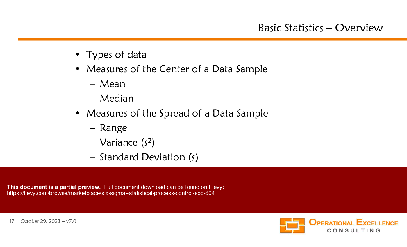
• Introduction to Statistical Process Thinking,
• Basic Statistics,
• Introduction to Statistical Process Control,
• Statistical Process Control Charts,
• Sample Size & Frequency,
• Out-of-Control Action Plan, and
• Process Control Plan.
2. MS Excel Confidence Interval Analysis Calculator making it really easy to calculate confidence intervals (mean value, standard deviation, capability indices, proportion, count) and perform a Comparison of two statistics (mean values, standard deviations, proportions, counts).
"After you have downloaded the training material, you can change any part of the training material and remove all logos and references to Operational Excellence Consulting. You can share the material with your colleagues and clients, and re-use it as you need. The only restriction is that you cannot publicly re-distribute, sell, rent or license the material as though it is your own. Thank you."
This comprehensive training module delves into the intricacies of Statistical Process Control (SPC), providing a historical context and a detailed examination of traditional process control concepts. It outlines the limitations of conventional methods and introduces the critical importance of identifying and addressing process variations. The module emphasizes practical applications, ensuring that your team can implement these strategies effectively to enhance productivity and customer satisfaction.
The presentation also covers advanced statistical techniques, including the creation and interpretation of control charts, and the application of various statistical tests to ensure process stability and capability. By integrating these tools into your operational framework, you can proactively manage process performance, reduce variability, and achieve higher levels of operational excellence. This training is an essential resource for any organization committed to continuous improvement and operational efficiency.
Got a question about the product? Email us at support@flevy.com or ask the author directly by using the "Ask the Author a Question" form. If you cannot view the preview above this document description, go here to view the large preview instead.
Source: Best Practices in SPC, Six Sigma Project, Six Sigma, Statistical Process Control PowerPoint Slides: Six Sigma - Statistical Process Control (SPC) PowerPoint (PPTX) Presentation Slide Deck, Operational Excellence Consulting LLC
This PPT slide presents a visual representation of Statistical Process Control (SPC) focusing on the distinction between common and special causes of variation in processes. It illustrates 2 scenarios: one where common causes dominate and another where special causes are prevalent.
In the first scenario, the output of a process characterized by common causes forms a stable and predictable distribution over time, depicted by green curves. This stability suggests that the process is operating within its normal range, allowing for reliable predictions about future performance. The accompanying graph indicates a consistent trend, reinforcing the notion of predictability in outcomes.
Conversely, the second scenario highlights the impact of special causes of variation, represented by red curves. Here, the output lacks stability and predictability, indicating that external factors or anomalies are influencing the process. The graph shows erratic behavior, suggesting that the process may be subject to unexpected changes, making it difficult to forecast future results accurately.
The question mark in the prediction line for the special causes scenario emphasizes uncertainty, signaling that without addressing these special causes, the process cannot be effectively controlled. This distinction is crucial for organizations aiming to improve operational efficiency. Understanding whether variations stem from common or special causes can guide decision-making and process improvement initiatives.
This slide serves as a foundational piece for those looking to grasp SPC principles, offering insights into how variations affect process stability and predictability. It underscores the importance of identifying the root causes of variation to enhance process management and drive better outcomes.
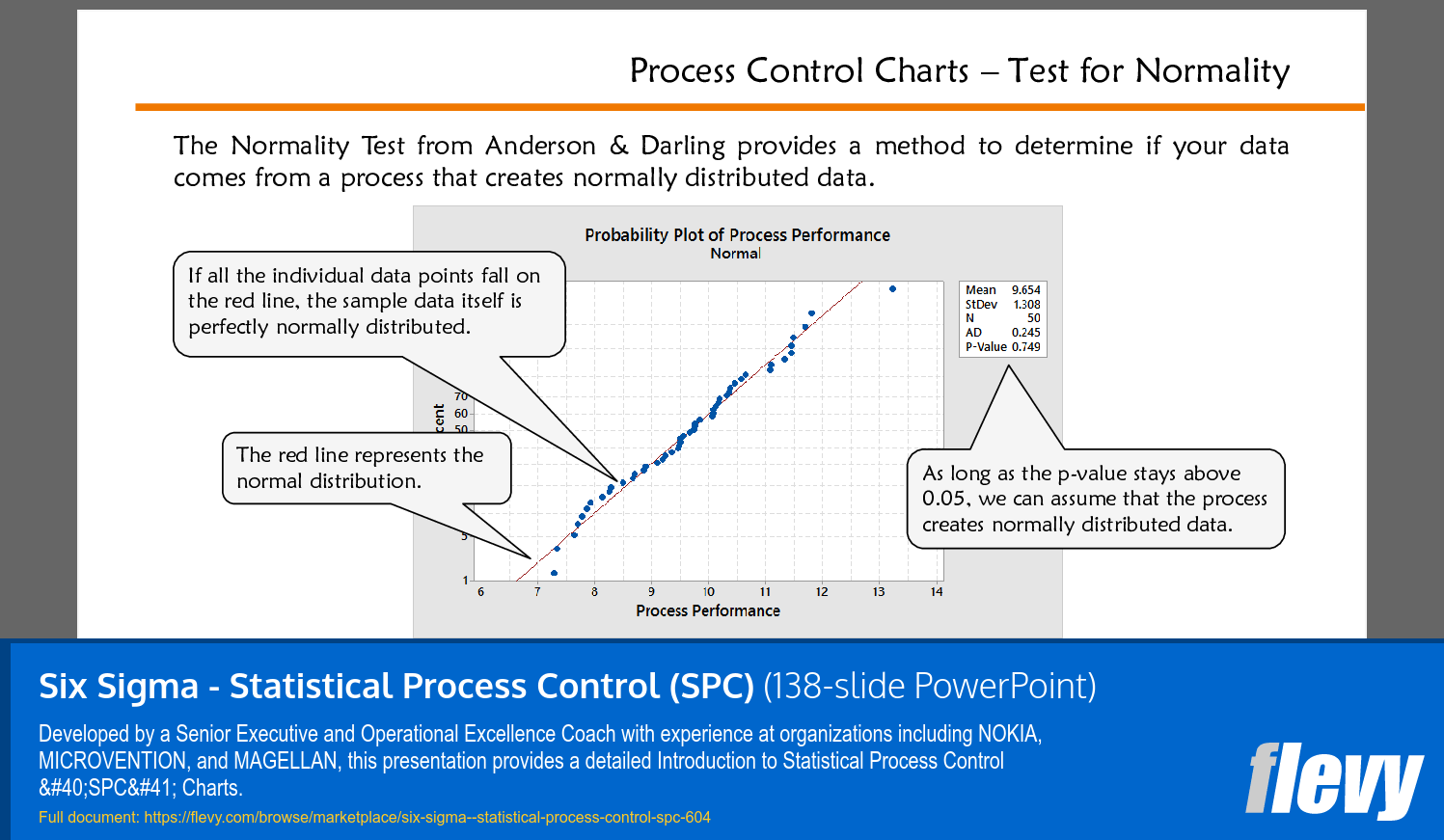
This PPT slide presents the Normality Test from Anderson & Darling, which is a statistical method used to evaluate whether a dataset originates from a normally distributed process. The central visual is a probability plot, where the x-axis represents process performance and the y-axis indicates the percentage of data points. A red line is featured prominently, symbolizing the normal distribution.
Key insights include the interpretation of data points in relation to the red line. If all individual data points align with this line, it indicates that the sample data is perfectly normally distributed. This is crucial for organizations relying on statistical process control, as many quality control methodologies assume normality in data.
The slide also includes statistical metrics such as mean, standard deviation, sample size (N), Anderson-Darling statistic (AD), and the p-value. The p-value, in particular, is highlighted as a critical threshold for determining normality. A p-value above 0.05 suggests that the data can be assumed to be normally distributed. This is a significant point for decision-making, as it informs whether further statistical analyses can be reliably conducted.
Understanding the normality of data is essential for executives looking to implement effective process control measures. It allows for better risk management and enhances the reliability of operational decisions. The graphical representation and accompanying explanations provide a clear framework for assessing data normality, making it a valuable resource for leaders focused on operational excellence.
This PPT slide presents a foundational overview of 2 primary types of data relevant to statistical analysis: Attribute Data and Continuous Data.
Attribute Data, categorized as discrete data, encompasses qualitative measures. Examples include classifications such as "good" or "bad," specific machine identifiers like Machine 1, Machine 2, and Machine 3, as well as shift numbers. This type of data is primarily concerned with countable items, making it essential for quality control and categorical assessments.
On the other hand, Continuous Data, also referred to as variable data, includes quantitative measures that can take on any value within a given range. Key examples listed are time and speed, pressure, and physical measurements like height and weight. This data type allows for more nuanced analysis since it can capture variations and trends over time.
The slide emphasizes that the distinction between Y and X data types is crucial, as it influences the selection of appropriate statistical tools for analysis. Understanding these categories is vital for any organization aiming to implement effective statistical process control. By grasping these concepts, executives can better leverage data to drive decision-making and operational efficiency. The visual aids accompanying the text reinforce the definitions, providing a clearer understanding of how these data types manifest in practical scenarios. This foundational knowledge is indispensable for those looking to enhance their analytical capabilities in a business context.
This PPT slide presents a structured overview of various types of control charts used in process control, specifically within the context of Six Sigma methodologies. Each row outlines a specific metric, categorized by the type of data it represents and the corresponding chart type to be utilized for analysis.
The first metric, "Monthly average 'Days to Payment,'" indicates a continuous data type, which is represented using an Individual/Moving Range (I/MR) chart. This suggests a focus on tracking payment cycles over time, critical for cash flow management. The "Total monthly sales of a product" is similarly categorized, emphasizing the importance of monitoring sales trends.
Metrics such as "Number of late planes per day in Dallas" and "Number of incomplete orders in a month" fall under discrete data types, represented by p-charts. These metrics are essential for operational efficiency, allowing organizations to identify patterns in service delivery and order fulfillment.
The slide also highlights the "Percent of invoices that are correct," which is crucial for maintaining accuracy in billing processes. This metric, along with others like "Number of units with defects per 1000 produced," showcases the focus on quality control and error reduction.
The inclusion of metrics related to call times and product thickness indicates a comprehensive approach to monitoring both service and manufacturing processes. Each chart type is tailored to the specific nature of the data, ensuring appropriate analysis and actionable insights.
Overall, this slide serves as a practical guide for executives looking to implement or enhance process control measures within their organizations, providing clarity on which metrics to monitor and how to visualize them effectively.
This PPT slide presents a visual analysis of how to determine if a process generates normally distributed data. It features 4 histograms, each representing different sample sizes: 10, 100, 500, and 10,000. Each histogram displays frequency on the vertical axis and sample size on the horizontal axis. A red curve overlays each histogram, indicating the normal distribution.
The first histogram, with a sample size of 10, shows a distribution that is somewhat irregular, suggesting that small sample sizes may not adequately reflect normality. As the sample size increases to 100, the histogram begins to resemble a bell curve, indicating a stronger alignment with normal distribution characteristics. The histogram for sample size 500 further solidifies this trend, showcasing a more pronounced bell shape and a tighter fit to the normal curve.
However, the histogram for sample size 10,000 presents an interesting deviation. While it maintains a bell shape, the data appears to be skewed, suggesting that even large sample sizes can yield non-normal distributions under certain conditions. This highlights the importance of sample size in statistical analysis and the necessity for ongoing evaluation of data distribution.
Key takeaways include the critical role of sample size in assessing normality and the potential for misleading conclusions if one relies solely on visual inspection of smaller samples. Understanding these dynamics is essential for making informed decisions based on statistical data. This slide serves as a foundational introduction to the principles of statistical process control, emphasizing the need for rigorous analysis in operational contexts.
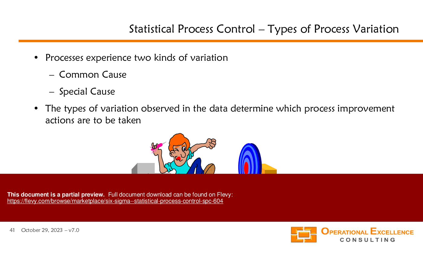
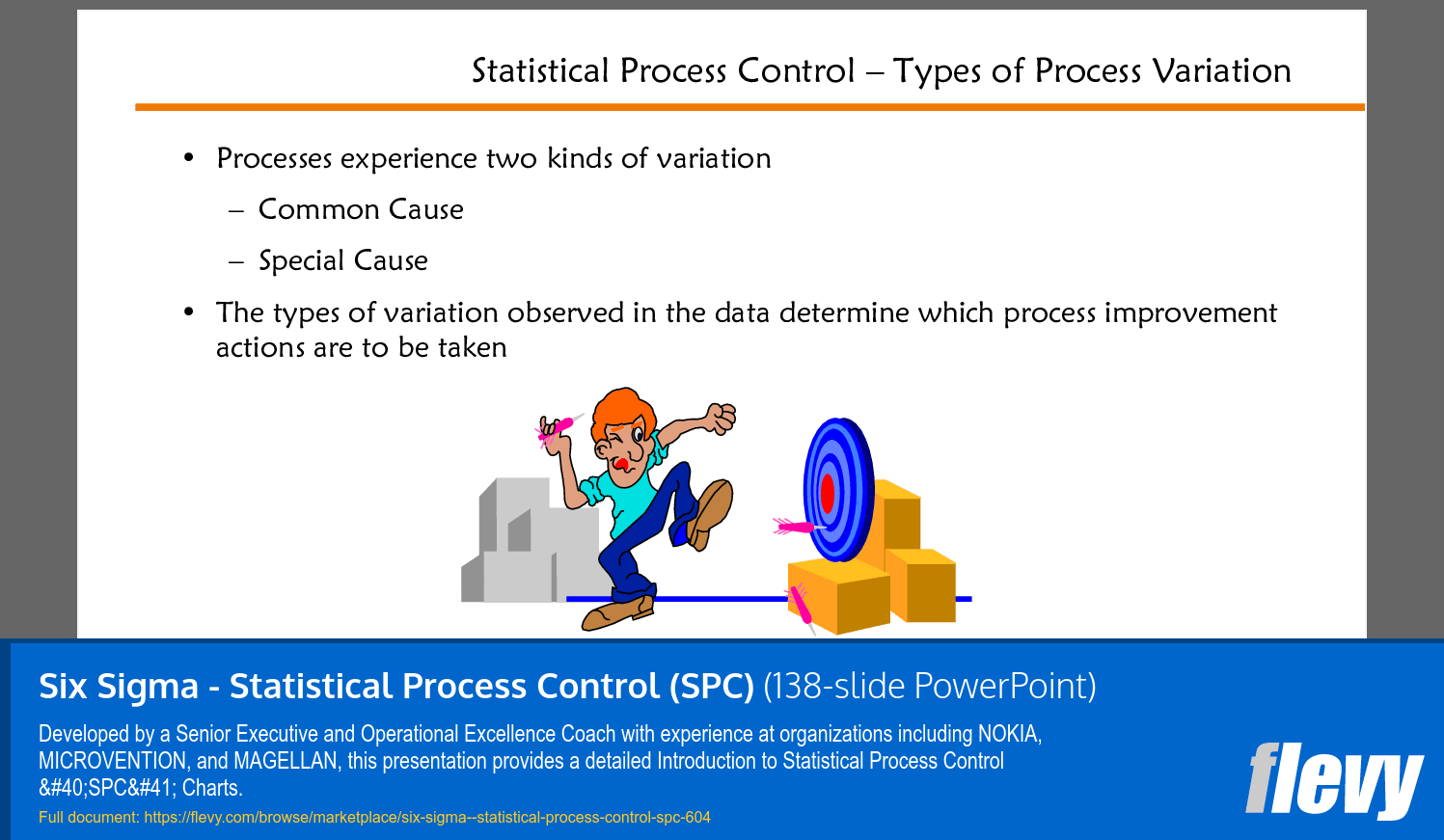
This PPT slide presents an overview of Statistical Process Control (SPC) and highlights 2 primary types of variation that processes encounter: Common Cause and Special Cause. Understanding these variations is crucial for organizations aiming to enhance their operational efficiency.
Common Cause variation refers to the inherent fluctuations that occur in a process due to its natural variability. These are typically stable and predictable over time. On the other hand, Special Cause variation arises from specific, identifiable factors that can lead to unexpected changes in the process. This distinction is vital for determining the appropriate response to variations observed in data.
The slide emphasizes that recognizing the type of variation is essential for deciding on process improvement actions. If the variation is due to Common Causes, efforts should focus on systemic changes to the process. Conversely, if Special Causes are identified, targeted interventions can be implemented to address the specific issues at hand.
This framework allows organizations to prioritize their improvement initiatives effectively. By analyzing variation types, teams can allocate resources more efficiently and ensure that interventions are both timely and relevant. The visual representation on the slide, featuring a character aiming at a target, reinforces the idea of precision in identifying and addressing process variations.
For decision-makers considering this content, the slide serves as a foundational understanding of SPC, illustrating how the identification of variation types can drive meaningful improvements in process management.
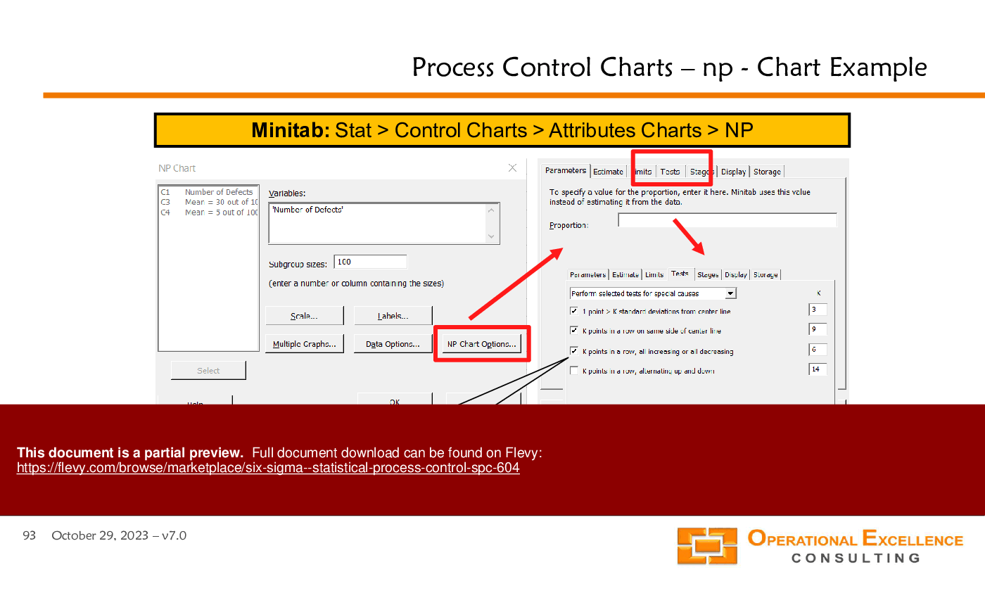
This PPT slide presents a practical example of using Minitab software for creating Individual-Moving Range (I-MR) control charts, a key tool in statistical process control. The left section displays the Minitab interface, specifically the path to access the I-MR chart functionality: Stat > Control Charts > Variable Charts for Individuals > I-MR. This hierarchical navigation is crucial for users to efficiently locate the necessary tools within the software.
The central part of the slide highlights the parameters for the I-MR chart, emphasizing the selection of variables, which in this case is labeled as "Process Y." This indicates that the user can customize the chart based on specific processes they are monitoring. The right section of the slide outlines the options available for configuring the I-MR chart. It includes various parameters such as limits, tests for special causes, and the ability to display different types of data.
A notable feature is the list of out-of-control criteria, which are essential for identifying when a process may be deviating from expected performance. This list is based on the foundational work of Walter Shewhart, who established many of the principles of statistical process control in the 1920s. By understanding these criteria, users can better interpret the data generated by the I-MR chart and take appropriate actions to maintain process stability.
Overall, this slide serves as a concise guide for users looking to implement I-MR charts in Minitab, providing both a visual representation of the software interface and a foundational understanding of the underlying statistical principles.
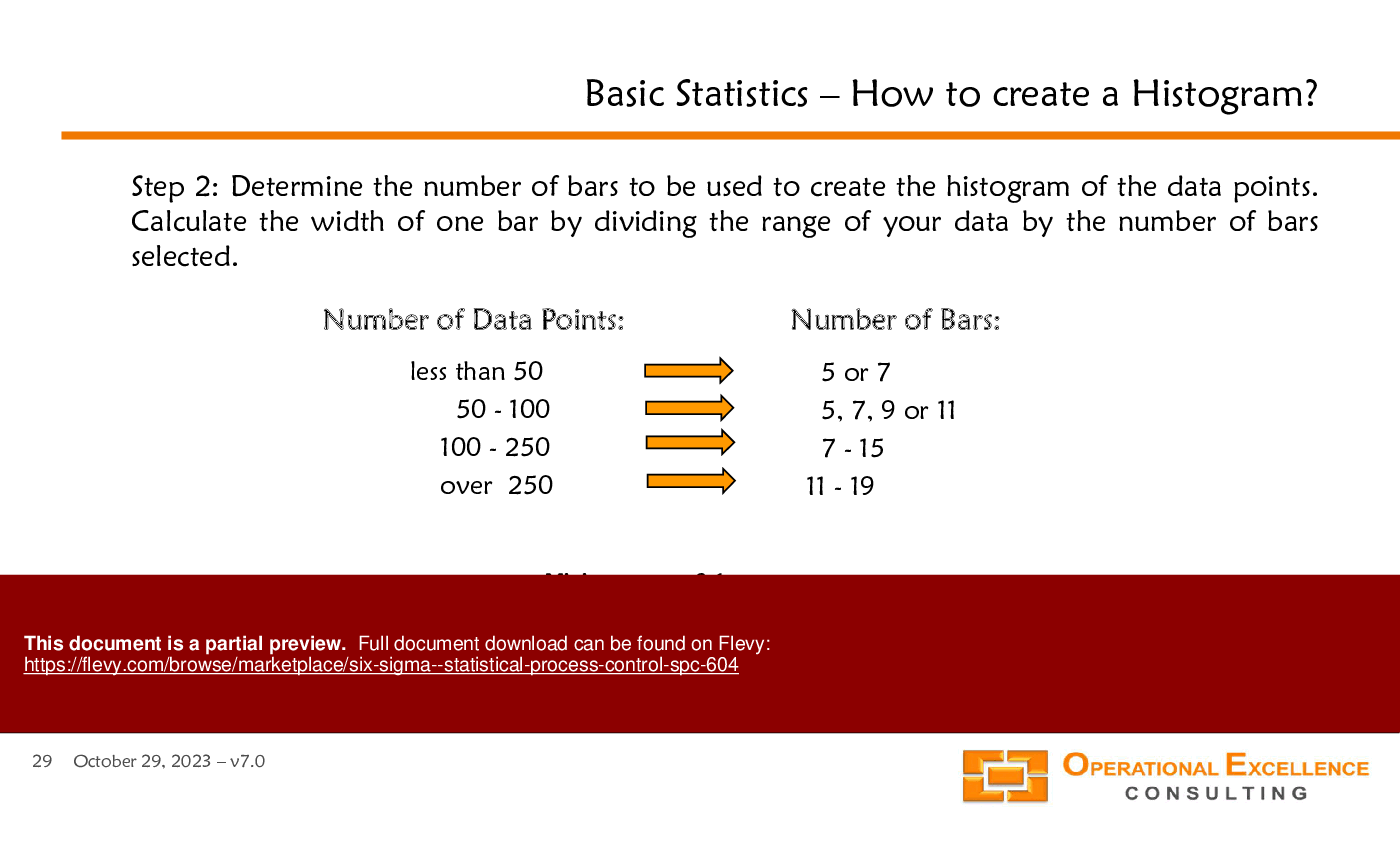
A histogram serves as a visual tool to summarize and analyze data distributions. This PPT slide outlines the fundamental aspects of creating a histogram, emphasizing its role in providing a graphical representation of data. The primary function of a histogram is to offer an initial assessment of the data's location, spread, and overall shape.
The slide features a dot plot labeled "Dotplot of Brightness," which illustrates the distribution of brightness values ranging from 543 to 558. Each bar in the histogram corresponds to a specific range of brightness values, with the height of the bars indicating the frequency of occurrences within those ranges. This visual format allows for quick identification of patterns or anomalies in the data, enabling stakeholders to make informed decisions based on empirical evidence.
Understanding how to create and interpret a histogram is crucial for any organization aiming to leverage data for strategic initiatives. It facilitates a clearer understanding of data characteristics, which can lead to more effective problem-solving and process improvements. The slide implies that mastering this basic statistical tool is essential for deeper analysis and operational excellence.
By utilizing histograms, organizations can better visualize their data, leading to enhanced insights into operational processes and outcomes. This foundational knowledge can significantly impact data-driven decision-making and strategic planning efforts.
This PPT slide presents an example of an I-MR (Individual-Moving Range) chart, a tool used in statistical process control. The upper section of the slide features the I-MR chart for Process Y, displaying individual data points collected over a series of observations. The chart includes key reference lines: the upper control limit (UCL) at 14.21, the average (X) at 9.45, and the lower control limit (LCL) at a value not explicitly shown, but implied to be below the average. This setup allows for monitoring the stability and variability of the process over time.
The lower section illustrates the Moving Range chart, which focuses on the differences between consecutive individual data points. This chart is crucial for understanding the variability in the process. The UCL for the Moving Range is set at 5.848, while the lower control limit is at 0, indicating that the range of variation is being closely monitored.
The annotations on the slide clarify the purpose of each chart. The I-MR chart helps visualize the individual data points, while the Moving Range chart emphasizes the changes between those points. This dual approach provides a comprehensive view of process performance, allowing for quick identification of trends, shifts, or anomalies.
For executives considering this document, the slide underscores the importance of using statistical tools to maintain process quality and efficiency. By leveraging these charts, organizations can make informed decisions based on data, ultimately leading to improved operational performance and customer satisfaction. Understanding these concepts is essential for any organization aiming to enhance its process management capabilities.
This PPT slide provides a practical guide on creating a histogram, focusing on the initial steps of data collection and organization. The first step emphasizes the importance of gathering a substantial dataset, ideally between 50 to 100 data points, although a minimum of 25 is acceptable. This sets the foundation for effective statistical analysis.
The slide illustrates 2 columns: "Actual Measurements" and "Sorted Measurements." The left column lists ten actual measurements of hole sizes associated with different parts, showcasing the raw data. The right column presents the same measurements sorted from smallest to largest. This sorting is crucial as it aids in visualizing the distribution of the data, which is a key aspect of histogram creation.
Additionally, the slide highlights the calculation of the range, defined as the difference between the maximum and minimum values in the dataset. The minimum and maximum values are explicitly stated as 2.1 and 3.1, respectively, resulting in a range of 1.0. This numerical summary provides insight into the variability of the data, which is essential for understanding the dataset's spread.
Overall, the slide serves as a foundational tool for those looking to delve into statistical analysis, particularly in the context of Six Sigma and Statistical Process Control. It underscores the significance of data organization and preliminary calculations in the histogram creation process, which can ultimately lead to more informed decision-making.
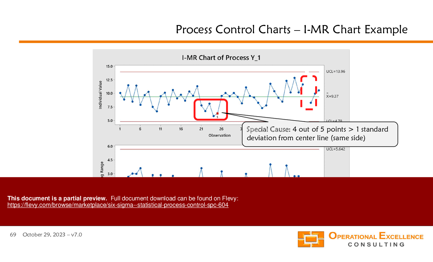
This PPT slide presents an I-MR (Individual-Moving Range) chart, a vital tool in Statistical Process Control (SPC). It illustrates the performance of a specific process, labeled as Process Y, over a series of observations. The chart is divided into 2 main sections: the upper section shows individual values, while the lower section displays the moving range.
In the upper chart, individual values are plotted against observation numbers. A central line indicates the average value, with upper and lower control limits (UCL and LCL) set at 14.21 and 4.69, respectively. The data points fluctuate around the average,, but a notable pattern emerges around observation 6, highlighted in a red box. This indicates a potential special cause, as 4 out of 5 points exceed one standard deviation from the center line on the same side. This could signify an anomaly in the process that warrants further investigation.
The lower chart focuses on the moving range, which is essential for understanding variability in the process. The moving range values are plotted similarly, with their own UCL and LCL set at 5.848 and 0. The data points here show less fluctuation, suggesting that while individual values may vary, the overall consistency of the process is relatively stable.
This slide serves as a practical example of how to interpret I-MR charts. It emphasizes the importance of identifying special causes that may affect process stability. For organizations looking to enhance operational efficiency, understanding these charts can lead to informed decision-making and targeted improvements.
A Control Plan serves as a foundational document outlining an organization’s quality planning efforts for specific processes, products, or services. This PPT slide emphasizes the objectives of an effective Process Control Plan, which are crucial for maintaining operational efficiency and quality standards.
The first objective highlights the importance of consistent process operation. This means that processes should be executed with minimal variation, which directly correlates to reduced waste and the need for rework. Achieving this consistency is vital for organizations aiming to enhance productivity and reduce costs.
The second objective focuses on institutionalizing product and process improvements. It’s not enough to identify enhancements; these improvements must be integrated into the organization’s standard practices. This institutionalization ensures that the benefits of improvements are sustained over time, leading to ongoing operational excellence.
The third objective addresses the necessity of adequate training. For a Process Control Plan to be effective, all personnel must be well-versed in standard operating procedures, work instructions, and the tools required for their roles. This training is essential for ensuring that everyone involved understands their responsibilities and can execute processes effectively.
The visual elements on the slide illustrate the flow from customer requirements through product and part characteristics, process input and output characteristics, and finally to process controls and the overarching Process Control Plan. This flow underscores the interconnectedness of various components in achieving quality and operational goals. Understanding these objectives can guide organizations in developing robust quality management systems that drive performance and customer satisfaction.
This PPT slide presents an I-MR chart example, which is a tool used in statistical process control to monitor process performance over time. The chart is divided into 2 sections: the I-chart and the MR chart. The I-chart tracks individual measurements, while the MR chart monitors the moving range of those measurements.
In the first section, the text highlights that the process performance data reveals one special cause affecting the process. This special cause is also reflected in the MR chart, which leads to an increase in the average moving range (MR). Consequently, this affects the short-term standard deviation, which is crucial for calculating the control limits for the I-chart. The control limits are indicated as UCL (Upper Control Limit) and LCL (Lower Control Limit), with specific values provided (UCL = 5.72, LCL = 3.05).
The second section emphasizes the need to exclude special causes that appear in the MR chart to ensure that all special causes can be accurately identified in the I-chart. This distinction is critical for maintaining the integrity of the data analysis. The MR chart also has its own control limits (UCL = 7.42, MR = 2.27), which are essential for understanding the variability in the process.
Overall, this slide serves as a practical illustration of how to interpret I-MR charts, highlighting the importance of distinguishing between common and special causes in process monitoring. Understanding these concepts is vital for any organization aiming to enhance process quality and operational efficiency.
This PPT slide presents a model for understanding Statistical Process Thinking, emphasizing the relationship between inputs, processes, and outputs. It categorizes inputs into several key components: manpower, measures, methods, materials, machines, and even environmental factors, referred to as "Mother Nature." This comprehensive list highlights the various elements that can influence the process, suggesting that effective management of these inputs is crucial for achieving desired outcomes.
The central part of the slide illustrates "The Process," which is divided into 4 sequential steps. This structured approach indicates a systematic method for transforming inputs into outputs. The flow from inputs to the process and finally to outputs underscores the importance of each stage in achieving successful results. Outputs are defined broadly as reports, products, services, and potentially more, indicating that the model can apply to various contexts and industries.
The mathematical representation at the bottom, \( Y = f(X_1, X_2, X_3, \ldots, X_n) \), signifies that the outputs (Y) are a function of the inputs (Xs). This formula encapsulates the essence of process thinking, where understanding the relationship between inputs and outputs is fundamental to improving performance.
For executives considering the implementation of Statistical Process Control, this slide serves as a foundational overview. It emphasizes the need for a structured approach to process management, highlighting the critical role of inputs and the systematic transformation into valuable outputs. This model can guide organizations in refining their processes to enhance efficiency and effectiveness.
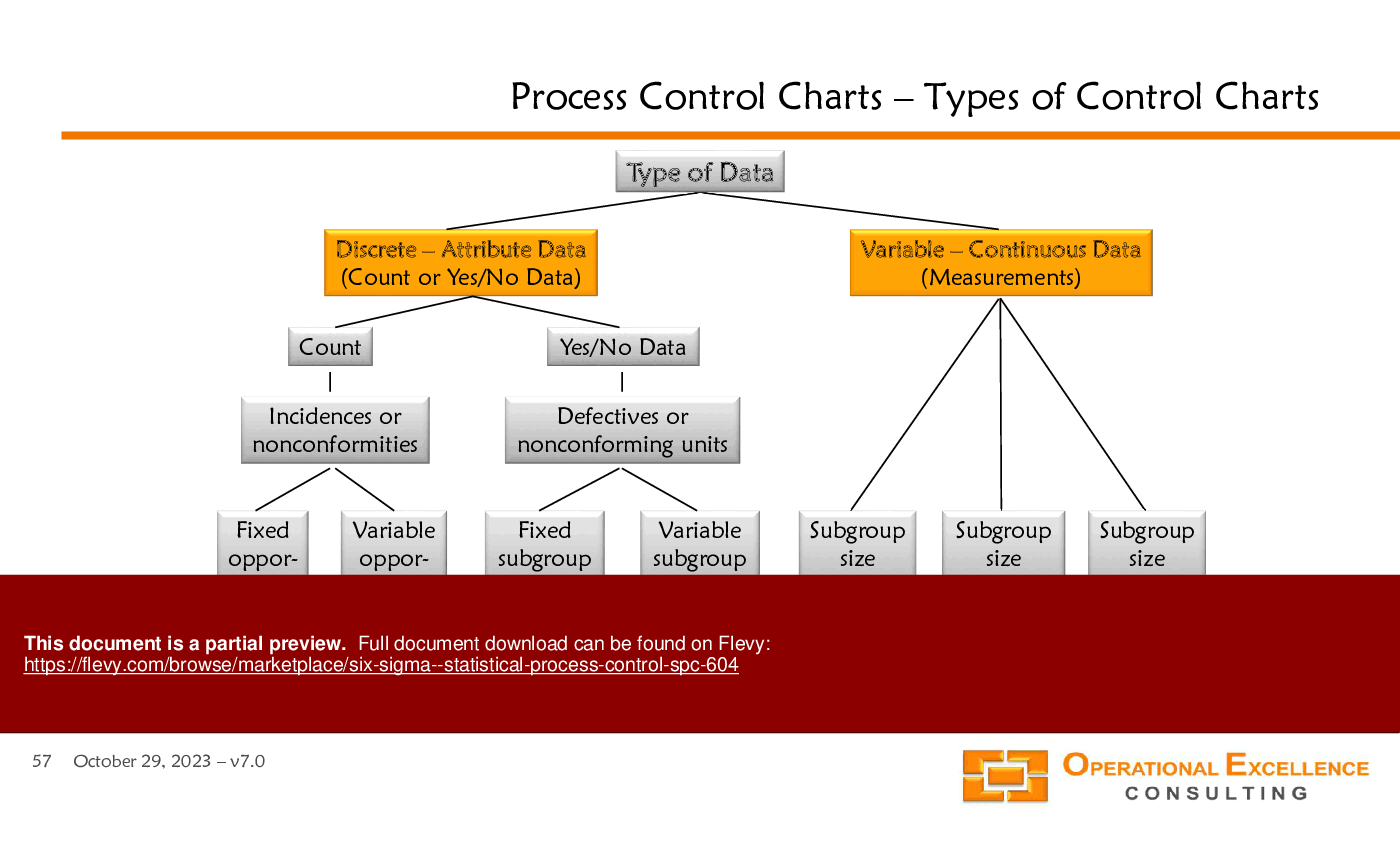
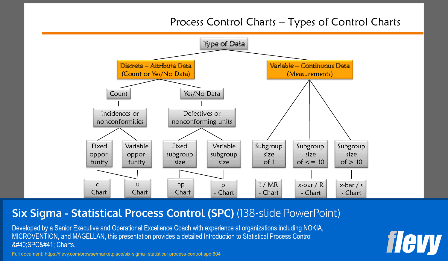
This PPT slide presents a structured overview of process control charts, categorizing them based on the type of data they handle. It distinguishes between discrete (attribute) data and variable (continuous) data, which is fundamental for effective statistical process control.
Under discrete data, the slide outlines 2 primary branches: "Count" and "Yes/No Data." The "Count" category further breaks down into incidences or nonconformities, leading to fixed and variable opportunities. The specific charts used for these types are the c-chart and u-chart, which are essential for tracking defects in a defined sample size.
On the other hand, the "Yes/No Data" section focuses on defects or nonconforming units, which can also be categorized into fixed and variable subgroup sizes. This part highlights the np-chart and p-chart, which are vital for monitoring proportions of defective items in a process.
The variable data section is divided into subgroup sizes of one, less than or equal to ten, and greater than ten. This segmentation is crucial because it determines the appropriate control charts to utilize, such as the I/MR chart and x-bar charts. Each chart type serves a specific purpose, depending on the data characteristics, which is critical for maintaining quality control.
This slide serves as a practical guide for organizations aiming to implement or refine their process control systems. Understanding these distinctions allows for better decision-making regarding quality management and operational efficiency. It emphasizes the importance of selecting the right chart based on data type, which can significantly impact process improvement initiatives.
Developed by a Senior Executive and Operational Excellence Coach with experience at organizations including NOKIA, MICROVENTION, and MAGELLAN, this presentation provides a detailed Introduction to Statistical Process Control (SPC) Charts.
Operational Excellence Consulting LLC (OEC LLC) provides assessments, training solutions, kaizen event facilitation, and implementation support to enable our clients to achieve superior performance through Operational Excellence - Strategy Deployment & Hoshin Planning, Performance Management & Balanced Scorecards, Process Excellence & Lean Six Sigma, and
... [read more]High Performance Work Teams.
Frank Adler co-founded OEC LLC in 2009 to follow his passion for Operational Excellence and to be able to work with individuals and organizations that share this passion.
He is not only an accomplished and recognized Operational Excellence, Lean Management, and Six Sigma coach, but has also over 20 years of domestic and international executive leadership experience in General Management, multi-site Operations & Supply Chain Management, and Quality & Customer Support Management.
Frank is a certified and experienced Lean Six Sigma Master Black Belt, with a proven track record of implementing these methods, concepts, and tools in various organizations and industries.
He holds a Master of Science in Mathematics and Physics from the Freie University of Berlin (Germany) and a Doctor of Philosophy in Applied Mathematics and Industrial Economics from the Helsinki University of Technology (Finland).
Since 2012, we have provided best practices to over 10,000 businesses and organizations of all sizes, from startups and small businesses to the Fortune 100, in over 130 countries.
Read Customer Testimonials
"As a consulting firm, we had been creating subject matter training materials for our people and found the excellent materials on Flevy, which saved us 100's of hours of re-creating what already exists on the Flevy materials we purchased."
– Michael Evans, Managing Director at Newport LLC
"I have used Flevy services for a number of years and have never, ever been disappointed. As a matter of fact, David and his team continue, time after time, to impress me with their willingness to assist and in the real sense of the word. I have concluded in fact
that it is not at all just a repository of documents/resources but, in the way that David and his team manage the firm, it is like dealing with consultants always ready to assist, advise and direct you to what you really need, and they always get it right.
I am an international hospitality accomplished senior executive who has worked and lived during the past 35 years in 23 countries in 5 continents and I can humbly say that I know what customer service is, trust me.
Aside from the great and professional service that Flevy's team provide, their wide variety of material is of utmost great quality, professionally put together and most current.
Well done Flevy, keep up the great work and I look forward to continue working with you in the future and to recommend you to a variety of colleagues around the world.
"
– Roberto Pelliccia, Senior Executive in International Hospitality
"[Flevy] produces some great work that has been/continues to be of immense help not only to myself, but as I seek to provide professional services to my clients, it gives me a large "tool box" of resources that are critical to provide them with the quality of service and outcomes they are expecting."
– Royston Knowles, Executive with 50+ Years of Board Level Experience
"Flevy.com has proven to be an invaluable resource library to our Independent Management Consultancy, supporting and enabling us to better serve our enterprise clients.
The value derived from our [FlevyPro] subscription in terms of the business it has helped to gain far exceeds the investment made, making a subscription a no-brainer for any growing consultancy – or in-house strategy team."
– Dean Carlton, Chief Transformation Officer, Global Village Transformations Pty Ltd.
"I have found Flevy to be an amazing resource and library of useful presentations for lean sigma, change management and so many other topics. This has reduced the time I need to spend on preparing for my performance consultation. The library is easily accessible and updates are regularly provided. A wealth of great information."
– Cynthia Howard RN, PhD, Executive Coach at Ei Leadership
"As a consultant requiring up to date and professional material that will be of value and use to my clients, I find Flevy a very reliable resource.
The variety and quality of material available through Flevy offers a very useful and commanding source for information. Using Flevy saves me time, enhances my expertise and ends up being a good decision."
– Dennis Gershowitz, Principal at DG Associates
"As a niche strategic consulting firm, Flevy and FlevyPro frameworks and documents are an on-going reference to help us structure our findings and recommendations to our clients as well as improve their clarity, strength, and visual power. For us, it is an invaluable resource to increase our impact and value."
– David Coloma, Consulting Area Manager at Cynertia Consulting
"FlevyPro has been a brilliant resource for me, as an independent growth consultant, to access a vast knowledge bank of presentations to support my work with clients. In terms of RoI, the value I received from the very first presentation I downloaded paid for my subscription many times over! The
quality of the decks available allows me to punch way above my weight – it's like having the resources of a Big 4 consultancy at your fingertips at a microscopic fraction of the overhead.
"
– Roderick Cameron, Founding Partner at SGFE Ltd
Save with Bundles
This document is available as part of the following discounted bundle(s):
Receive our FREE presentation on Operational Excellence
This 50-slide presentation provides a high-level introduction to the 4 Building Blocks of Operational Excellence. Achieving OpEx requires the implementation of a Business Execution System that integrates these 4 building blocks.