
 Click main image to view in full screen. Unlock all 14 preview images:
Cognitive Load in Presentations: Slides People Remember – PowerPoint PPTX Template
PowerPoint (PPTX) + supplemental PDF 68 Slides


BENEFITS OF THIS DOWNLOADABLE POWERPOINT DOCUMENT
- Explains why audiences lose the thread of a well-argued presentation, using the working memory limit rather than opinions about attention spans.
- Applies eight evidence-based multimedia learning principles to slides, each with a before-and-after example you can copy.
- Includes a repeatable thirty-minute audit and a printable worksheet for reviewing a deck you have already built.
COMMUNICATIONS STRATEGY PPT TEMPLATE DESCRIPTION
Most presentation advice tells you to use fewer words and better pictures. This deck explains why that advice works when it works, and what to do when it does not.
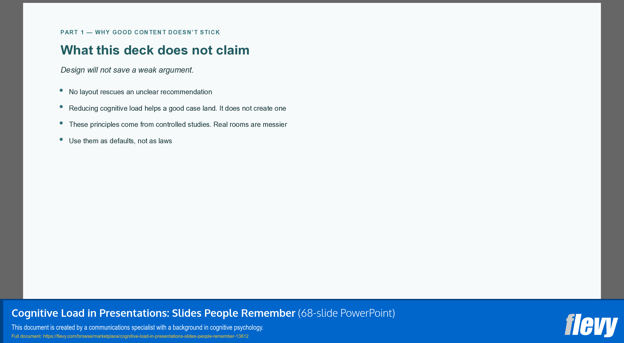
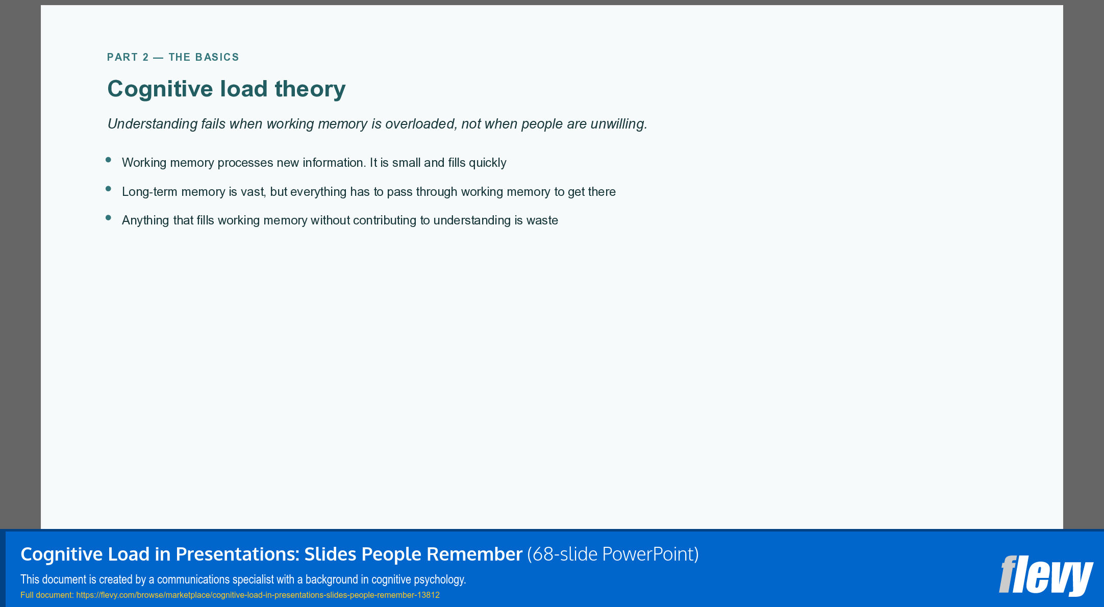
The starting point is a limit, not a style preference. Working memory holds about four items at a time, and everything your audience understands has to pass through it. When a slide fails, attention was not lost. It was spent, on decoding the slide instead of following the argument. Every recommendation here traces back to that one idea.
One thing to be clear about before you buy: this is a method, not a template set. It works with your own corporate template rather than replacing it.
Part 1 states the problem in the language of the people who pay for it: meetings that end without a conclusion, recommendations that need a second session, approvals that slip because the case never landed.
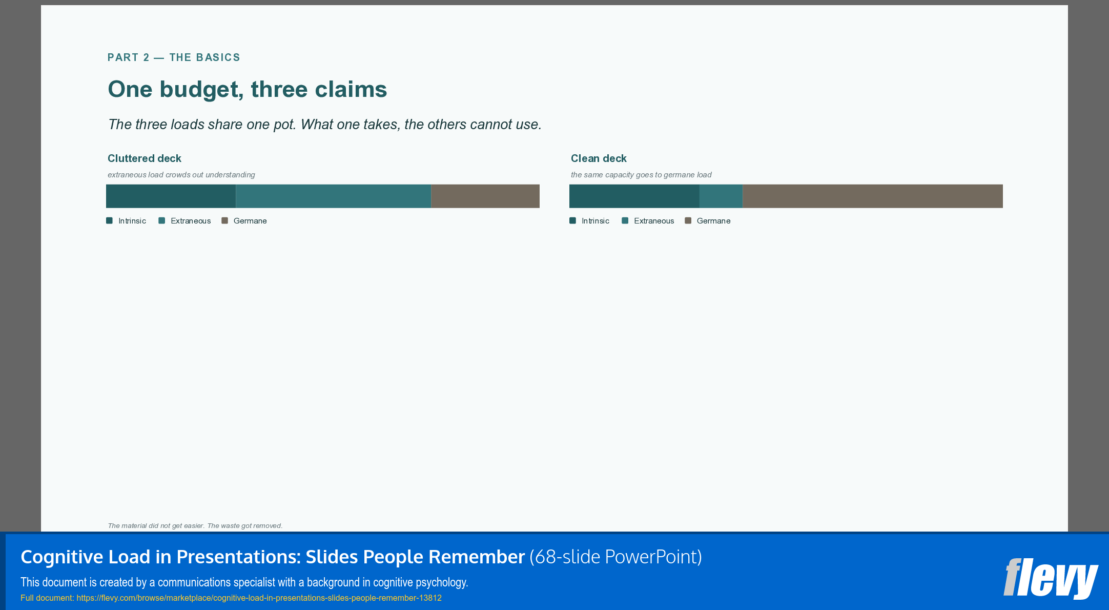
Part 2 covers the basics. Two modes of thinking, three kinds of cognitive load competing for one budget, and a correction to the most repeated number in presentation training. Most trainers quote seven plus or minus two. The practical figure is closer to four, and that difference changes how you build a slide.
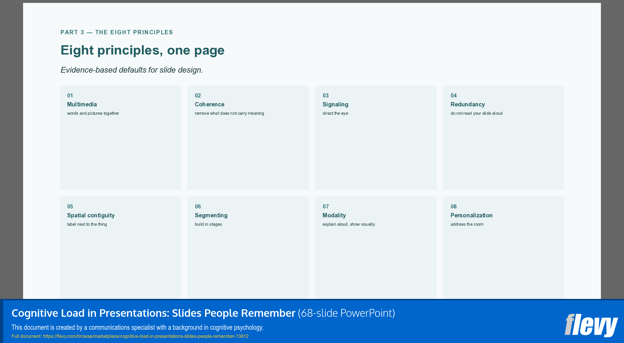
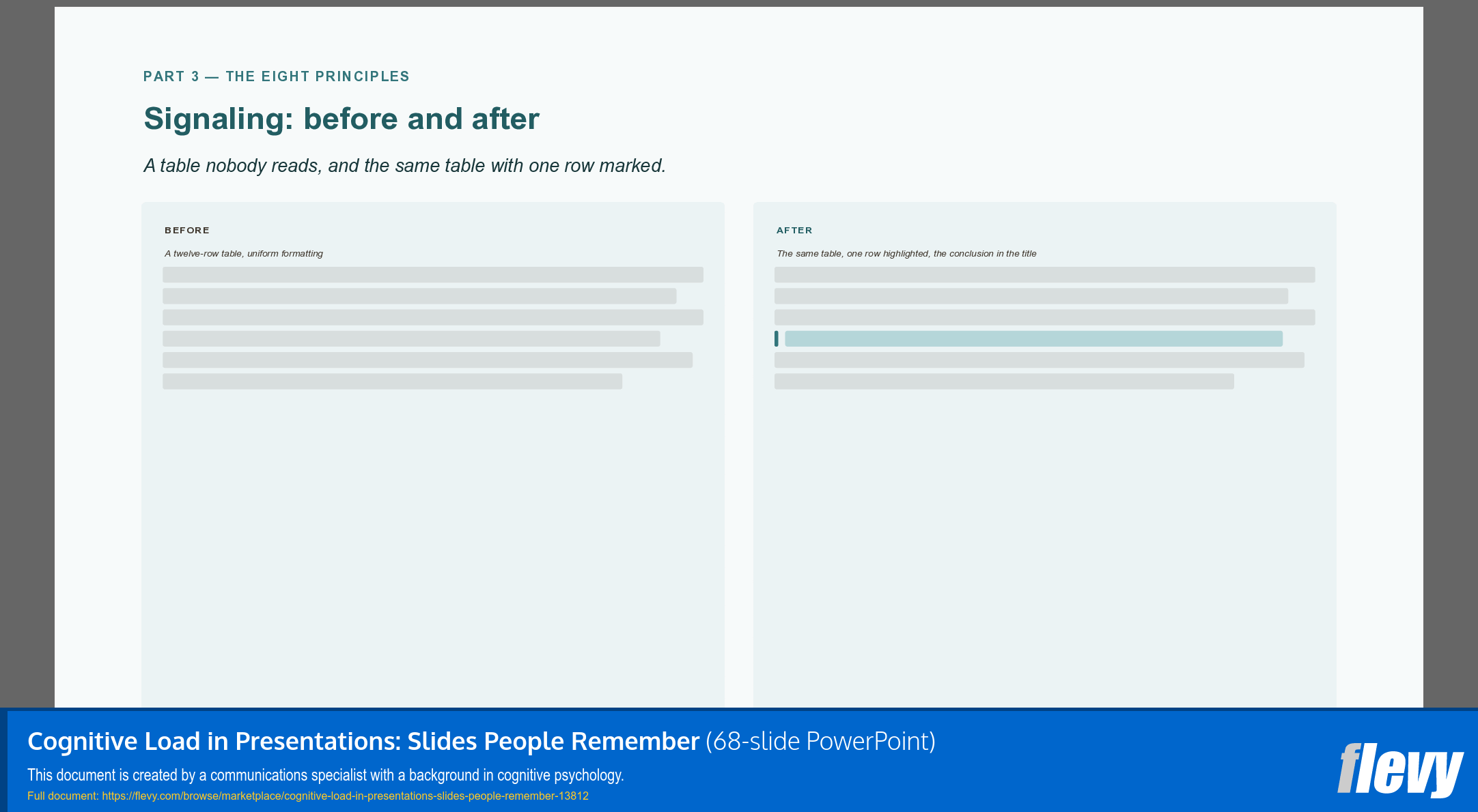
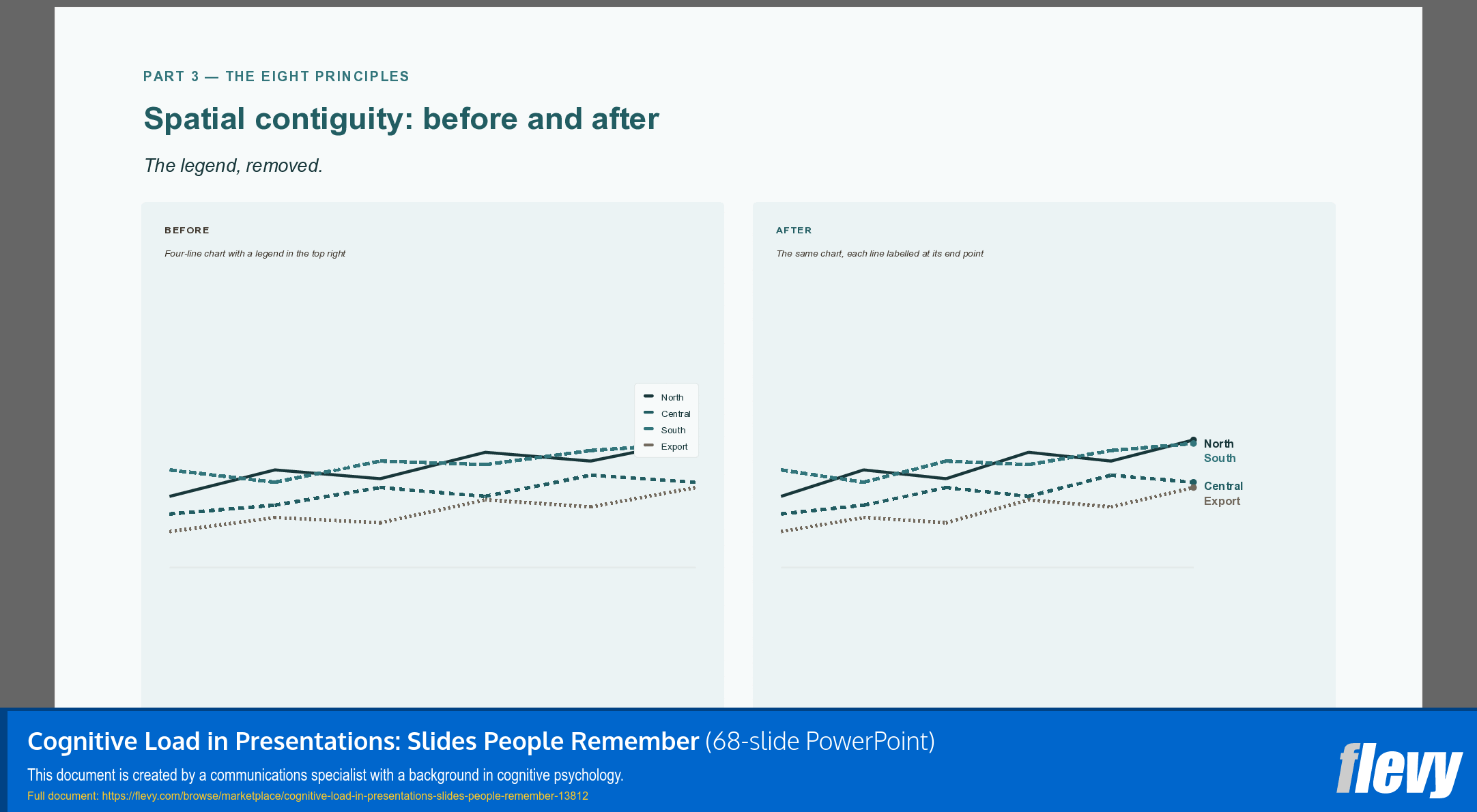
Part 3 applies eight evidence-based principles from multimedia learning research: multimedia, coherence, signaling, redundancy, spatial contiguity, segmenting, modality and personalization. Each one gets an explanation and a before-and-after example, followed by a single case slide rebuilt from fourteen elements with every principle applied in turn.
Part 4 covers visual ordering. How the eye groups before it interprets, what it reads first, and why white space is structure rather than decoration. It includes a section on designing for colour vision differences, with a deuteranopia simulation showing what happens when colour is the only thing carrying meaning.
Part 5 covers what people actually retain: the opening, the closing, and whatever broke the pattern.
Part 6 is the working part. A repeatable audit: nine questions per slide in three groups of three, six questions about the deck as a whole, and a thirty-minute review that ends by fixing one slide rather than rebuilding everything.
Part 7 addresses four persistent myths, including the triune brain and learning styles, and explains why each one survives correction.
Two things this deck does differently. It states what it does not claim: design will not rescue a weak argument. And it flags research that failed to replicate instead of quoting it as settled, with a full reference list at the back so every claim can be checked.
Speaker notes are included throughout, with pacing suggestions and questions to put to the room.
The accompanying document is a two-page printable worksheet containing both audit checklists, laid out so you can work through your own deck slide by slide.
Want the ready-to-use version of these eight principles? The companion toolkit, The Cognitive Load Slide Kit: 8 Ready-to-Use Layouts, turns them into sixteen editable slide layouts you can drop your own content into.
Got a question about the product? Email us at support@flevy.com or ask the author directly by using the "Ask the Author a Question" form. If you cannot view the preview above this document description, go here to view the large preview instead.
Source: Best Practices in Communications Strategy, Chart Design PowerPoint Slides: Cognitive Load in Presentations: Slides People Remember PowerPoint (PPTX) Presentation Slide Deck, Mind the Structure
ABOUT THE AUTHOR

Mind the Structure creates tools for people who build presentations: templates and
frameworks grounded in research on how people actually process and remember information. The approach translates cognitive load theory and Mayer's principles of multimedia learning into concrete, ready-to-use slide designs. The first release, "Cognitive Load in Presentations: Slides People Remember," walks
... [read more]
Ask the Author a Question
You must be logged in to contact the author.