Frequency Distribution Visuals: Histograms, Line Charts, Range Charts – PowerPoint PPT Template
PowerPoint (PPT) 6 Slides FlevyPro Document
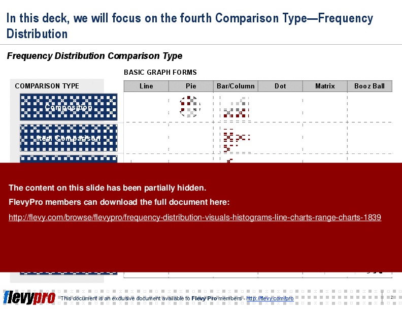
PRESENTATION DEVELOPMENT PPT TEMPLATE DESCRIPTION
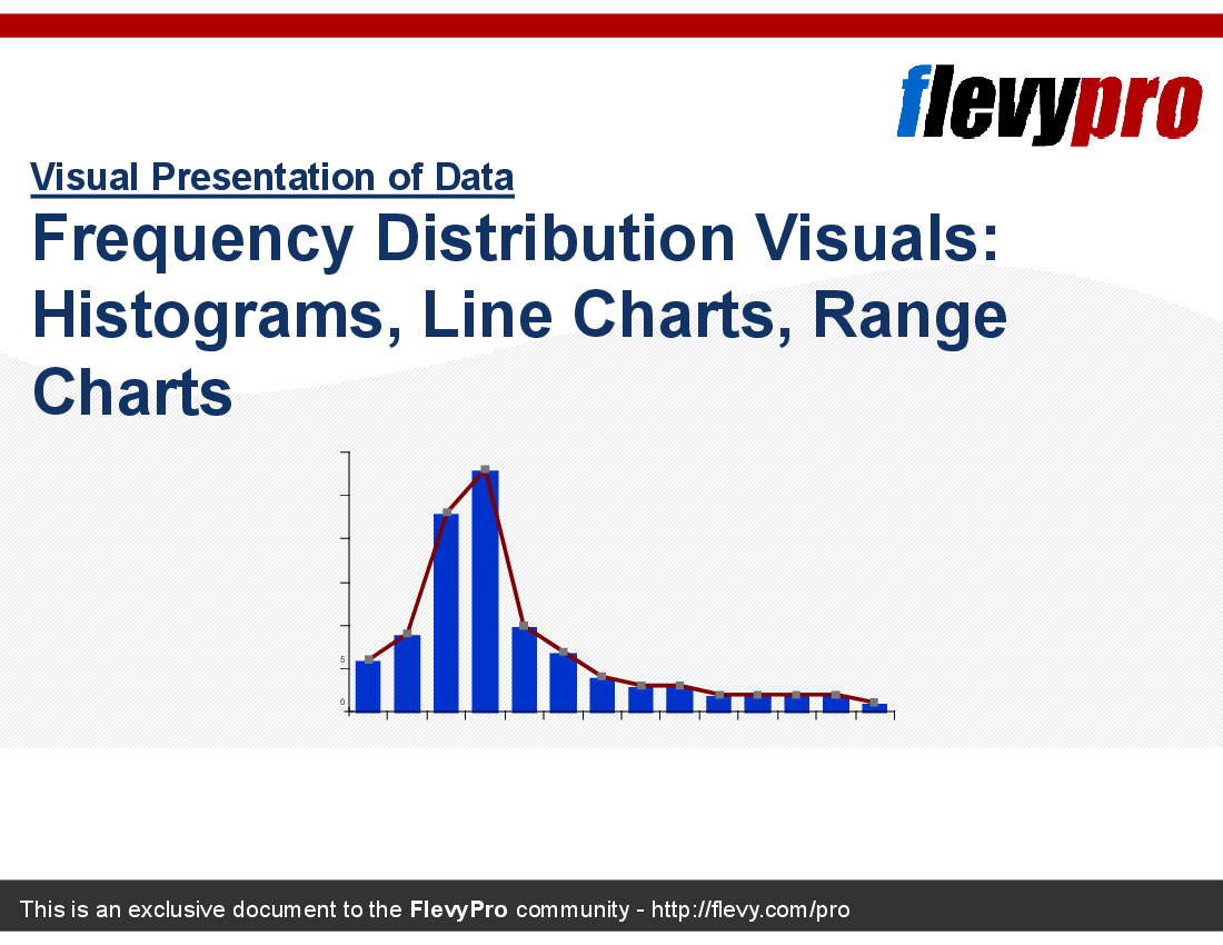
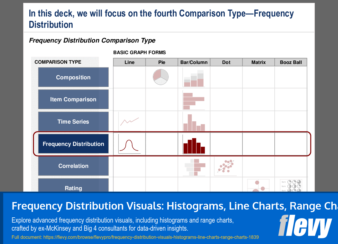
This presentation focuses on Frequency Distribution visuals: e.g., Histograms (Columnar and Step), Combination of Curve and Column, Range Charts.
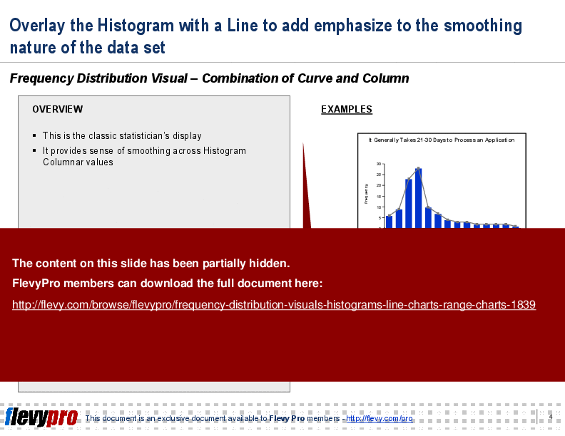
Dive deeper into the nuances of frequency distribution with our comprehensive guide. This PPT meticulously breaks down the use of histograms, including both columnar and step variations, to provide clear visual representations of data sets. The step histogram, in particular, is highlighted for its ability to emphasize areas around the curve, offering a more detailed analysis compared to traditional columnar histograms.
The combination of curve and column charts is another focal point, demonstrating how overlaying a line on a histogram can enhance the visualization of data smoothing. This classic statistical display is essential for executives looking to present data trends in a more refined manner. The examples provided illustrate the practical application of these techniques, making it easier to grasp their benefits.
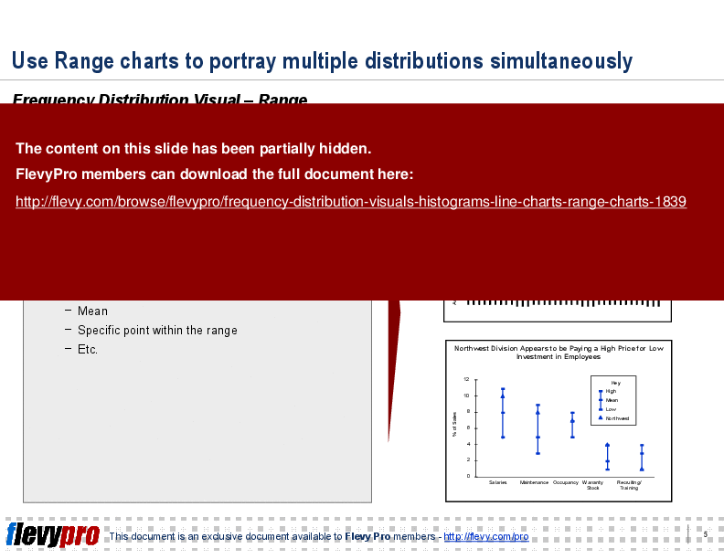
Range charts are also covered extensively, showcasing their utility in portraying multiple distributions simultaneously. This section is crucial for those who need to compare various data sets within a single visual framework. By highlighting specific points within the range, such as the mean, these charts offer a comprehensive view that aids in more informed decision-making.
Got a question about this document? Email us at flevypro@flevy.com.
Source: Best Practices in Presentation Development, Chart Design PowerPoint Slides: Frequency Distribution Visuals: Histograms, Line Charts, Range Charts PowerPoint (PPT) Presentation Slide Deck, LearnPPT Consulting
Add to Cart
Did you need more documents?
Consider a FlevyPro subscription from $39/month. View plans here.
For $10.00 more, you can download this document plus 2 more FlevyPro documents. That's just $13 each.