Powerful Executive Communication – PowerPoint PPTX Template
PowerPoint (PPTX) 74 Slides
STRUCTURED COMMUNICATION PPT TEMPLATE DESCRIPTION
In the realm of senior management, proficient communication skills are more than just a necessity—they're your ticket to making a lasting impact. Whether it's penning down compelling narratives or presenting influential pitches, the ability to convey ideas crisply and persuasively is indispensable, especially when engaging with the C-suite. The Executive Communication Excellence Framework, distilled from over 15 years of consulting and training expertise by top consultants from BCG and EY, is designed to elevate your communication skills to a level that not only resonates with top-tier executives but also amplifies your personal credibility.
Key Benefits:
- Writing Mastery: Learn the art of clear, engaging, and error-free writing that captures attention and conveys your message effectively.
- Structured Communication: Grasp the essence of logical message structuring to ensure your communication is coherent, concise, and impactful.
- Presentation Prowess: Embark on the journey of becoming a confident and persuasive presenter, capable of delivering captivating presentations that command respect and action.
Framework Insights:
1. Clear, Engaging, and Error-Free Writing:
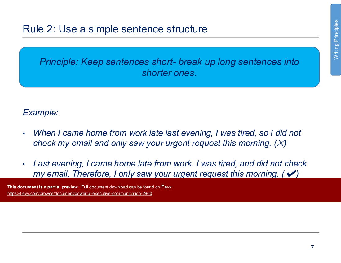
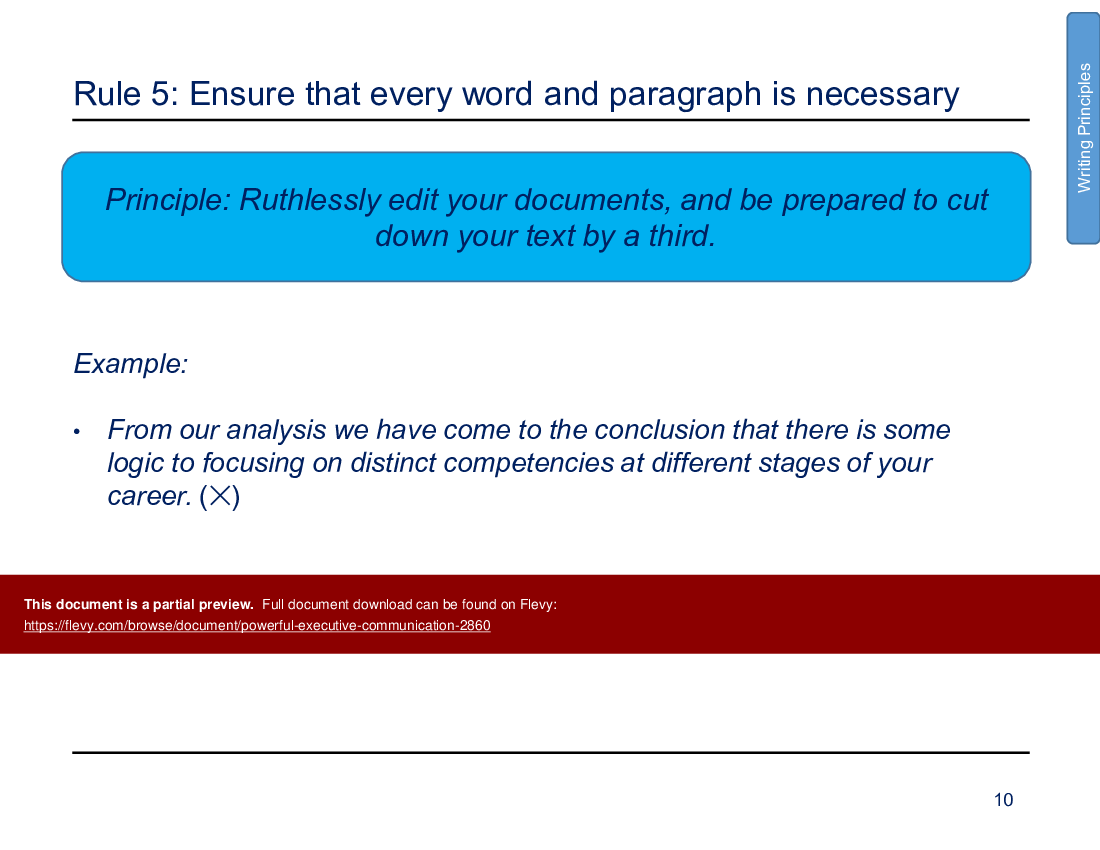
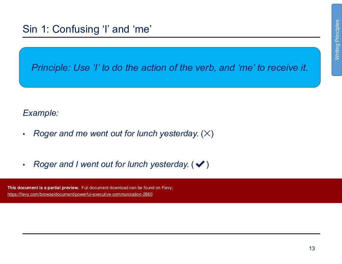
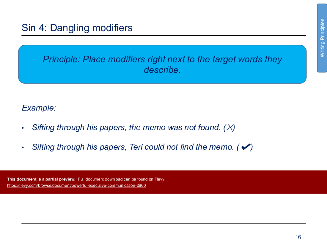
• Master the six rules of clear writing and steer clear of the five cardinal sins of poor grammar.
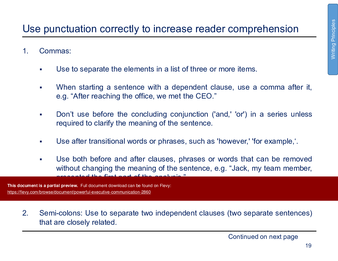
• Leverage correct punctuation to enhance reader comprehension and simplify ideas with bullet lists for better retention.
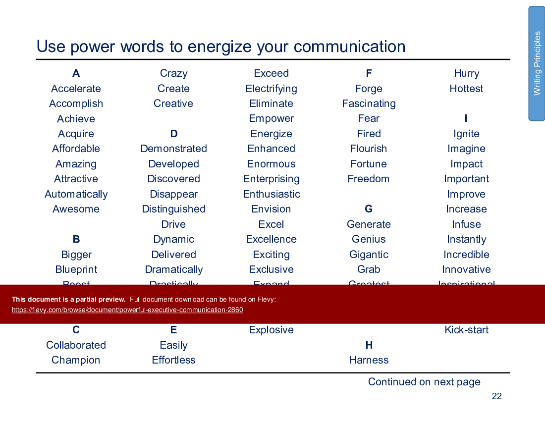
• Incorporate power words, professional writing style tips, and navigational devices such as headings and call-out boxes to energize and organize your communication.
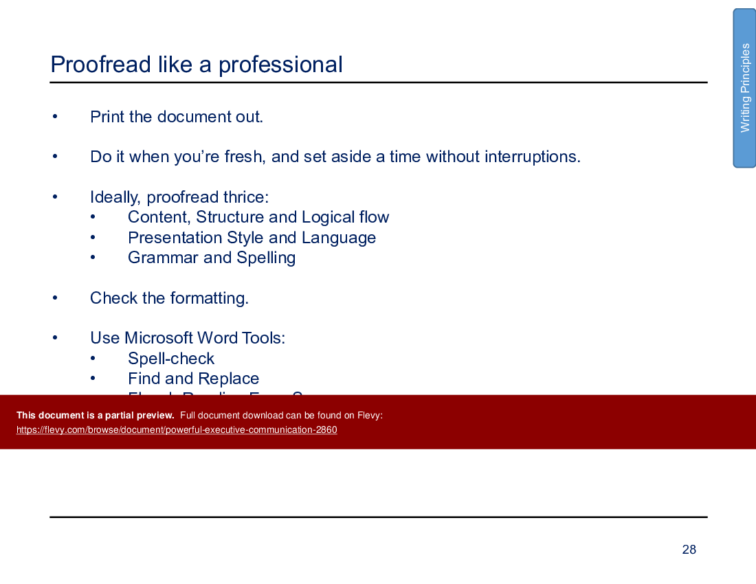
• Hone your proofreading skills to ensure a polished, professional finish to your documents.
2. Structuring Your Message:
• Clarify your purpose, understand your audience, and tailor your message for maximum relevance and impact.
• Adopt the "Pyramid Principle" to structure your communication logically and persuasively.
3. Presenting Your Message:
• Plan the horizontal and vertical logic in your story and use 'Ghosting Out' slides to visualize the presentation flow.
• Achieve a balanced mix of text and graphical elements for visual appeal, select the correct chart types for data representation, and employ "NLP" techniques for mental readiness.
• Master body language, vocal inflection, and pauses to enhance your presentation delivery, ensuring you communicate with confidence and passion.
Real World Examples:
• The framework includes detailed slide notes and exemplary slides from top-tier consulting firms like McKinsey, Bain, and BCG, providing a real-world glimpse into effective executive communication.
Embark on a transformative journey of communication mastery with the Executive Communication Excellence Framework. With each slide and note, unlock the secrets to resonating with the C-suite and accelerating your ascent in your career.
The PPT also covers the importance of using simple sentence structures and ensuring every word and paragraph is necessary. Learn to tailor your message based on your audience's social style and leverage the Pyramid Principle for logical communication.
Got a question about the product? Email us at support@flevy.com or ask the author directly by using the "Ask the Author a Question" form. If you cannot view the preview above this document description, go here to view the large preview instead.
PRESENTATION DEEP DIVE ANALYSIS
This deep-dive analysis was generated from the full 74-slide PowerPoint presentation.
STRUCTURED COMMUNICATION PPT TEMPLATES
Source: Best Practices in Structured Communication, Presentation Delivery, Pyramid Principle PowerPoint Slides: Powerful Executive Communication PowerPoint (PPTX) Presentation Slide Deck, Trinity Consulting
