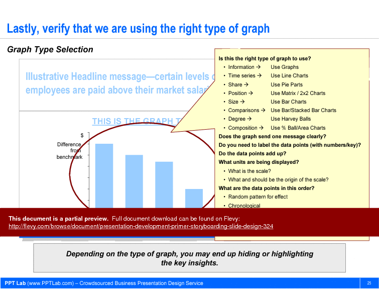
This PPT slide, part of the 28-slide Presentation Development Primer (Storyboarding, Slide Design) PowerPoint presentation, focuses on the selection of appropriate graph types for data presentation, emphasizing the importance of clarity and effectiveness in visual communication. It outlines various scenarios where specific graph types are recommended. For instance, it suggests using graphs for information display, line charts for time series data, pie charts for share representation, and matrix or 2x2 charts for position analysis. Each recommendation is tailored to the nature of the data being presented, indicating a strategic approach to data visualization.
The slide also poses critical questions to assess the effectiveness of the chosen graph. It prompts the viewer to consider whether the graph conveys a single clear message and whether data points are adequately labeled. This self-assessment encourages a thorough review of the graph's design and its ability to communicate insights effectively. The questions regarding the scale and origin of the data reinforce the need for precision and context in data representation.
The visual elements of the slide, including the highlighted graph, serve to illustrate the concepts discussed. The emphasis on the correct graph type is crucial for ensuring that the audience can easily interpret the data and derive meaningful conclusions. Missteps in graph selection can obscure key insights, making it essential to follow the guidelines presented. This slide ultimately serves as a practical guide for executives and decision-makers who need to present data in a clear and impactful manner.
This slide is part of the Presentation Development Primer (Storyboarding, Slide Design) PowerPoint presentation.
We are a firm of ex-consultants from McKinsey, E&Y, and Bearing Point specializing in designing consulting presentations. Learn exactly how strategy consultants craft and design presentations, from storyboarding to slide/graph/chart design.
EXPLORE MORE SLIDES FROM THIS PRESENTATION
EXPLORE MORE PRESENTATIONS ON
Flevy is the world's largest knowledge base of best practices.
![]()
Leverage the Experience of Experts.
Find documents of the same caliber as those used by top-tier consulting firms, like McKinsey, BCG, Bain, Deloitte, Accenture.
![]()
Download Immediately and Use.
Our PowerPoint presentations, Excel workbooks, and Word documents are completely customizable, including rebrandable.
![]()
Save Time, Effort, and Money.
Save yourself and your employees countless hours. Use that time to work on more value-added and fulfilling activities.

